Themes
MirrorFly UIKit for iOS provides themes to help you customize the style of your app. Through simple configurations, you can easily switch between Light and Dark themes and apply custom colors and fonts to the views.
MFUITheme is a singleton class that is used to configure themes. If you don't want to use the default user interfaces provided by UIKit, you can customize them by using the MFUITheme class. By customizing the theme of the view controller, you can apply the same custom theme to all its module components.
Set up the default global theme#
UIKit for iOS provides two global themes: Light and Dark. The Light theme is the default global theme but you can change it by using the instructions given below
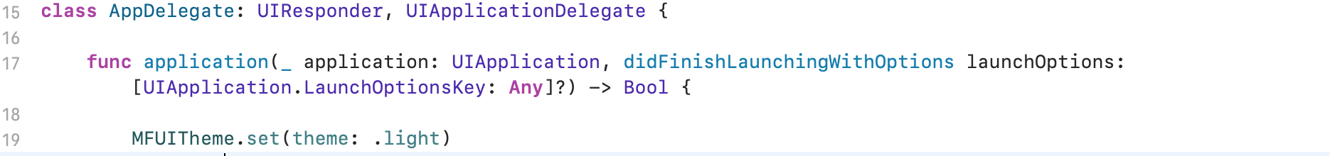
Light Theme#
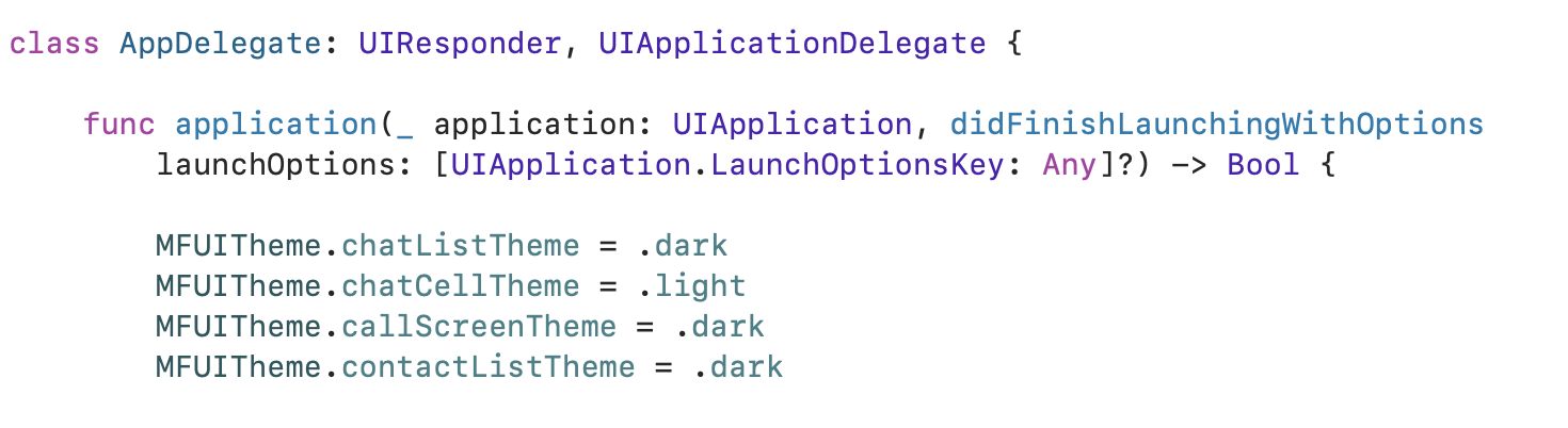
This is the default theme for UIKit. You can set the theme in your AppDelegate class as below
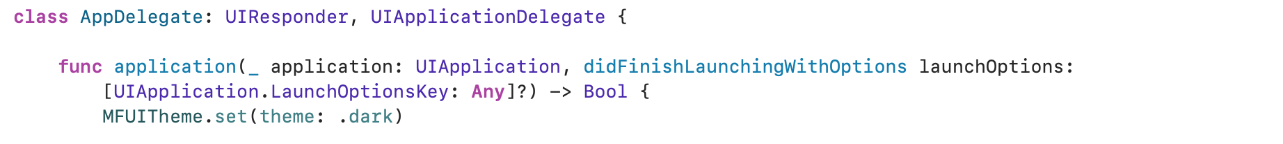
Dark Theme#
You can also apply the Dark theme to your app by following the below code in your AppDelegate class.
Note : The global theme should be configured prior to setting the view controller or creating a chat view.
Theme properties#
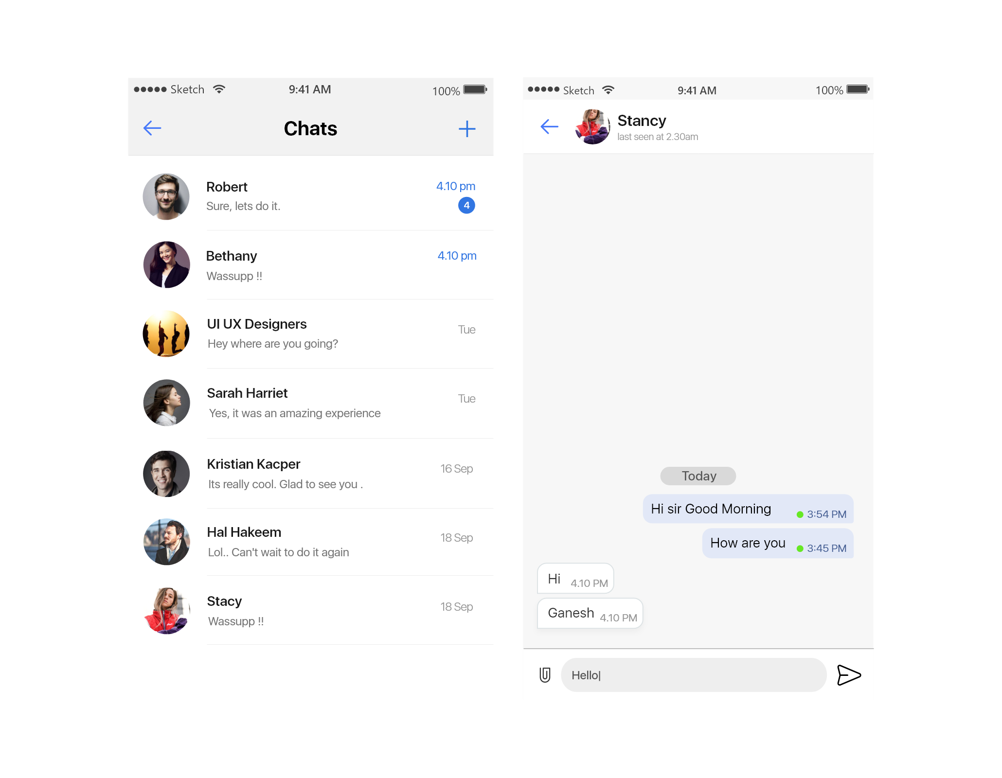
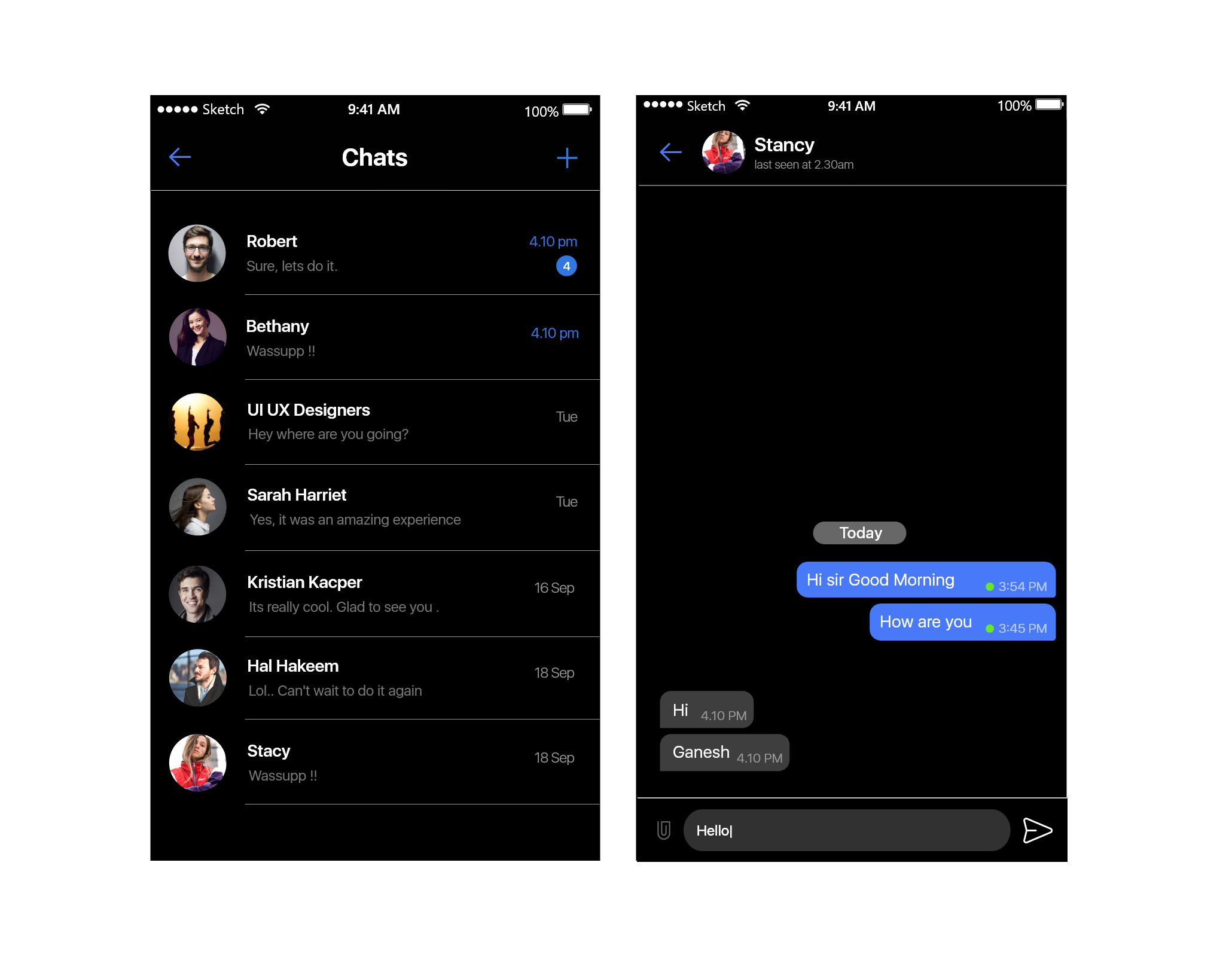
The Light theme appears by default when a view controller is initialized. The following table shows the customizable properties of the MFUITheme class. you can also set theme for each screen if you want.
| Property Name | Type | Where to use |
|---|---|---|
| MFUITheme.chatListTheme | MFChatListTheme | ChatList |
| MFUITheme.chatTheme | MFChatTheme | Chat |
| MFUITheme.chatCellTheme | MFChatCellTheme | Recent Chat Cell |
| MFUITheme.contactListTheme | MFContactListTheme | Contacts list |
| MFUITheme.callScreenTheme | MFCallScreenTheme | Call Screen |
| MFUITheme.messageInfoTheme | MFMessageInfoTheme | Message Info Screen |
| MFUITheme.userProfileTheme | MFUserProfileTheme | User Profile |
| MFUITheme.updateProfileTheme | MFUpdateProfileTheme | update Profile |