Recent Chats

Build the fragment#

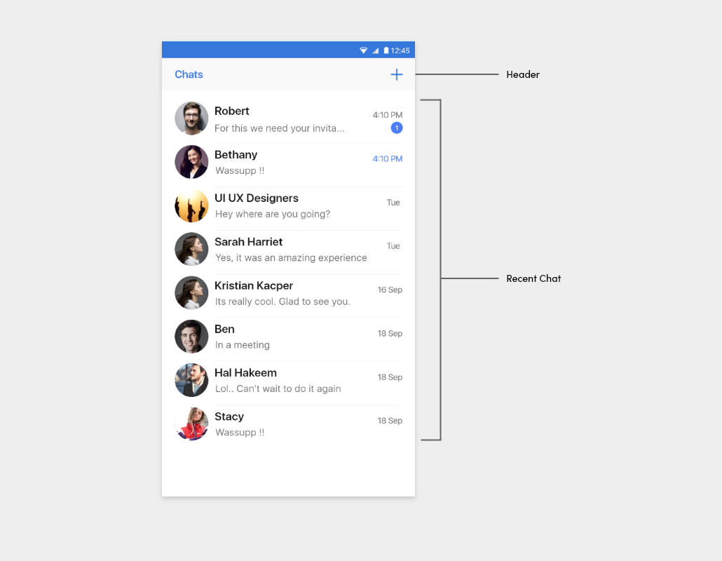
The FlyRecentChatFragment class enables you to customize the UI of your fly recenct chat view. As shown below, the fragment class is composed of two regions: the Header and Recent Chat.

  • Recent chat view

flychat

  • Chat Type

flychat

Fragment regions#

RegionDescription
HeaderActs as an optional ActionBar in the fly recent chat activity. By default, it displays the title and two buttons on the left and right, which are all customizable. If the left button is clicked, the finish() method of the activity will be called to close the current activity. If the right button is clicked, the user can determine which chat type to select. After the user selects a chat type, the user will be taken to ContactActivity.
Fly Recent chatDisplays the chat's cover image, chat name, number of unread messages, last message sent. If a chat is clicked, the user will be taken to the corresponding FlyChatActivity. It is fully customizable.

Set the fragment.builder()#

The FlyRecentChatFragment.Builder class provides APIs that enable you to create a customized FlyRecentChatFragment. Before building, the FlyRecentChatFragment’s settings can be customized using the builder’s setters. The following is an example of how to build the FlyRecentChatFragment:

var fragment: FlyRecentChatFragment = FlyRecentChatFragment.Builder()
.setCustomFlyRecentChatFragment(CustomFlyRecentChatFragment())
.setUseHeader(true)
.setHeaderTitle("Chat")
.setUseHeaderLeftButton(true)
.setUseHeaderRightButton(true)
.setHeaderLeftButtonIconResId(R.drawable.icon_arrow_left)
.setHeaderRightButtonIconResId(R.drawable.icon_create)
.setHeaderLeftButtonListener(leftButtonListener)
.setHeaderRightButtonListener(rightButtonListener)
.setItemClickListener(itemClickListener)
.build()

List of setter methods#

Setter methodDescription
setCustomFlyRecentChatFragment()Applies CustomFlyRecentChatFragment to FlyRecentChatFragment. By inheritance, CustomFlyRecentChatFragment should be a subclass of FlyRecentChatFragment.
setUserHeader()Determines whether the header is used. (Default: calls from an activity: true, calls from a fragment: false)
setHeaderTitle()Specifies the title of the header. (Default: Chats)
setUseHeaderLeftButton()Determines whether the left button of the header is used. (Default: true)
setUseHeaderRightButton()Determines whether the right button of the header is used. (Default: true)
setHeaderLeftButtonIconResId()Specifies the icon on the left button of the header. (Default: icon_arrow_left)
setHeaderLeftButtonIcon()Specifies the icon and the tint on the left button of the header. (Default: icon_arrow_left, light mode : primary_300, dark mode : primary_200)
setHeaderRightButtonIconResId()Specifies the icon on the right button of the header. (Default: icon_create)
setHeaderRightButtonIcon()Specifies the icon and the tint on the right button of the header. (Default: icon_create, light mode : primary_300, dark mode : primary_200)
setHeaderLeftButtonListener()Specifies the action of the click listener on the left button of the header. (Default: finish the current activity)
setHeaderRightButtonListener()Specifies the action of the click listener on the right button of the header. (Default: start the ContactActivity)
setItemClickListener()Specifies the action of the click listener on an item of the chat list. (Default: start the FlyChatActivity)

Customize the fly recent chat#

Create a User defined Activity (MFUICustomTestActivity) in the newly created project and implement the fragment function as follows:

class MFUICustomTestActivity : AppCompatActivity() {
lateinit var binding : ActivityMfuicustomTestBinding
override fun onCreate(savedInstanceState: Bundle?) {
super.onCreate(savedInstanceState)
binding = ActivityMfuicustomTestBinding.inflate(layoutInflater)
setContentView(binding.root)
var fragment = createFlyRecentChatFragment()
val manager = supportFragmentManager
manager.popBackStack()
manager.beginTransaction().replace(R.id.frag_container_custom, fragment).commit()
}
private fun createFlyRecentChatFragment(): FlyRecentChatFragment {
return FlyRecentChatFragment.Builder(R.style.CustomChatListStyle)
.setHeaderTitle("Custom Recent Chat")!!
.setUseHeader(true)!!
.setHeaderRightButtonIconResId(R.drawable.ic_person_add)!!
.build()
}
}
MFUICustomTestActivity layout xml file as follows :#
<?xml version="1.0" encoding="utf-8"?>
<androidx.constraintlayout.widget.ConstraintLayout xmlns:android="http://schemas.android.com/apk/res/android"
xmlns:app="http://schemas.android.com/apk/res-auto"
xmlns:tools="http://schemas.android.com/tools"
android:layout_width="match_parent"
android:layout_height="match_parent"
tools:context=".MFUICustomTestActivity">
<FrameLayout
android:id="@+id/frag_container_custom"
android:layout_width="match_parent"
android:layout_height="match_parent"/>
</androidx.constraintlayout.widget.ConstraintLayout>

Customize the style of the fly recent chat#

To customize the style of fly recent chat items, create style_custom.xml inside the res/values folder and add the value as follows:. The table below shows the style of fly recent chat items you can customize. You need to keep the original names of the items and parents defined by the UIKit during the process.

<resources>
<style name="AppThemeCustom" parent="Theme.AppCompat.Light.NoActionBar">
<item name="colorPrimary">@color/primary_300</item>
<item name="colorPrimaryDark">@color/primary_500</item>
<item name="colorAccent">@color/secondary_300</item>
</style>
<style name="MirrorFly.Custom" parent="AppThemeCustom">
<!-- Chat list -->
<item name="mf_chat_preview_style">@style/Widget.MirrorFly.ChatPreview.Custom</item>
<!-- Common components -->
<item name="mf_appbar_style">@style/Widget.MirrorFly.AppBar.Custom</item>
<item name="mf_recycler_view_style">@style/Widget.MirrorFly.RecyclerView.Custom</item>
</style>
<style name="Widget.MirrorFly.AppBar.Custom">
<item name="android:background">@color/primary_300</item>
<item name="mf_appbar_title_appearance">@style/MirrorFlyH2OnDark01</item>
<item name="mf_appbar_description_appearance">@style/MirrorFlyCaption2OnDark02</item>
<item name="mf_appbar_divider_color">@color/primary_500</item>
<item name="mf_appbar_left_button_text_appearance">@style/MirrorFlyButtonOnDark01</item>
<item name="mf_appbar_left_button_text_color">@color/selector_on_primary</item>
<item name="mf_appbar_left_button_tint">@color/ondark_01</item>
<item name="mf_appbar_left_button_background">@drawable/mf_button_uncontained_background_custom</item>
<item name="mf_appbar_right_button_text_appearance">@style/MirrorFlyButtonOnDark01</item>
<item name="mf_appbar_right_button_text_color">@color/selector_on_primary</item>
<item name="mf_appbar_right_button_tint">@color/ondark_01</item>
<item name="mf_appbar_right_button_background">@drawable/mf_button_uncontained_background_custom</item>
</style>
<style name="Widget.MirrorFly.RecyclerView.Custom">
<item name="android:background">@color/background_50</item>
<item name="mf_pager_recycler_view_use_divide_line">true</item>
<item name="mf_pager_recycler_view_divide_line_color">@color/onlight_04</item>
<item name="mf_pager_recycler_view_divide_line_height">@dimen/mf_size_1</item>
<item name="mf_pager_recycler_view_divide_margin_left">0dp</item>
<item name="mf_pager_recycler_view_divide_margin_right">0dp</item>
</style>
<style name="Widget.MirrorFly.ChatPreview.Custom">
<item name="android:background">@drawable/selector_rectangle_light</item>
<item name="mf_chat_preview_title_appearance">@style/MirrorFlySubtitle1OnLight01</item>
<item name="mf_chat_preview_updated_at_appearance">@style/MirrorFlyCaption2OnLight02</item>
<item name="mf_chat_preview_unread_count_appearance">@style/MirrorFlyCaption1OnDark01</item>
<item name="mf_chat_preview_last_message_appearance">@style/MirrorFlyBody3OnLight03</item>
</style>
</resources>
Theme - Apply custom style for Recent Chat#

Create a style called CustomChatListStyle in the themes.xml to customize the flyrecentchat. Override only the required widgets and customize their styles.

Example

Widgets :Widget.MirrorFly.AppBar
Attribute :android:background

rest of the widgets provides the default Ui.

<resources xmlns:tools="http://schemas.android.com/tools">
<!-- Base application theme code -->
// Add the following lines
<!-- CustomRecentChatListFragment -->
<style name="CustomChatListStyle" parent="MirrorFly.Custom">
<item name="mf_appbar_style">@style/CustomRecentChatListAppBar</item>
<item name="mf_recycler_view_style">@style/CustomChatListRecyclerView</item>
</style>
<style name="CustomRecentChatListAppBar" parent="Widget.MirrorFly.AppBar">
<item name="android:background">@color/custom_appbar</item>
</style>
<style name="CustomChatListRecyclerView" parent="Widget.MirrorFly.RecyclerView">
<item name="mf_pager_recycler_view_divide_margin_left">@dimen/mf_size_80</item>
<item name="android:background">@color/custom_recyclerview</item>
</style>
</resources>

Note : To apply the declared custom styles, pass the R.style.CustomChatListStyle to the FlyRecentChatFragment.Builder constructor as follows:

FlyRecentChatFragment.Builder(R.style.CustomChatListStyle).build()