Attachment
Attachment#
Attachment is a feature that allows users to send images,videos and documents. Attachment appears in the
message input field region of the FlyChatFragment class.
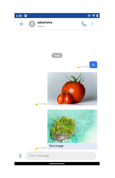
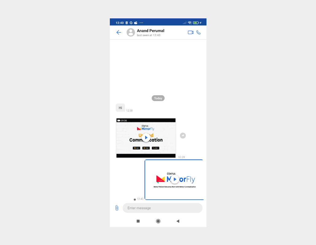
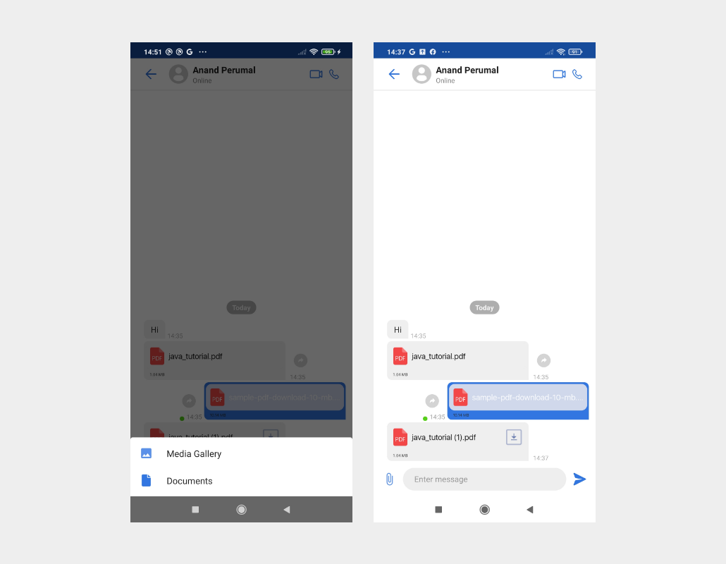
In MirrorFly UIKit for Android, there are currently three type of file messages that users can send : image, video and documents. These attachment files can be shared with other members in the single chat or group chat from the sender’s mobile device.
Gallery select option available in the attachment#
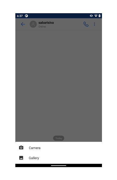
Image and Video Attachment#
Documents Attachment#
Customize the UI for Image and video Preview Screen#
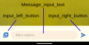
Preview screen regions#
| Region | Description |
|---|---|
| Header | Acts as an ActionBar in the activity. By default, it displays the back navigation button, preview name text, as well as two buttons on the left and right, which are all customizable. If the left button is clicked, the finish() method of the activity will be called to take the user to the media picker of the MeidaPickerActivity. If the right button is clicked, current image in the screen will be deleted |
| ViewPager | UIKit provides swipe option to see the selected imges. |
| Caption(Message) input field | Enables users to send a image with caption message which are all customizable |
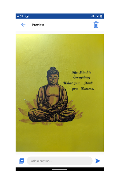
Image Preview Screen#
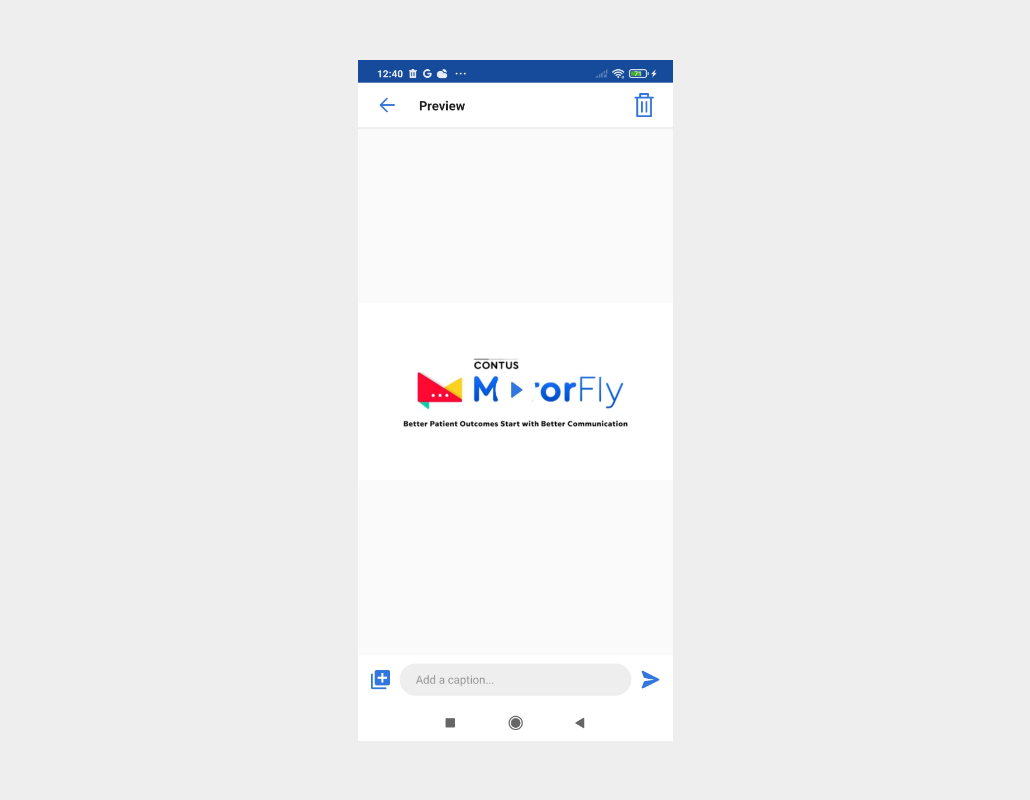
Video Post Preview Screen#
The following are the image and video preview screen AppBar style and attributes for customizations.#
List of attributes of Widget.MirrorFly.AppBar#
| Attribute | Resource type | Description |
|---|---|---|
| android:background | drawable/color | The background of the header. |
| mf_appbar_title_appearance | text appearance | The text size, color, font, and style of the header title. |
| mf_appbar_description_appearance | text appearance | The text size, color, font, and style of the header description. The header description is used to show the typing indicator and the time of when a user has last seen. |
| mf_appbar_button_tint | color | The color of the buttons. |
| mf_appbar_divider_color | color | The color of the line divider located at the bottom. |
| mf_appbar_left_button_text_appearance | text appearance | The text size, color, font, and style of the left button. |
| mf_appbar_left_button_text_color | color | The text color of the left button. |
| mf_appbar_left_button_tint | color | The color of the left button. |
| mf_appbar_left_button_background | drawable/color | The background of the left button. |
| mf_appbar_right_button_text_appearance | text appearance | The text size, color, font, and style of the right button. |
| mf_appbar_right_button_text_color | color | The text color of the right button. |
| mf_appbar_right_button_tint | color | The color of the right button. |
| mf_appbar_right_button_background | drawable/color | The background of the right button. |
The following are the image and video preview screen Caption Input style and attributes for customizations.#
List of attributes of Widget.MirrorFly.MessageInput#
| Attribute | Resource type | Description |
|---|---|---|
| mf_message_input_background | drawable/color | The background of message input. |
| mf_message_input_text_background | drawable/color | The background of message input text. |
| mf_message_input_text_appearance | text appearance | The size, color, font, style of text in message input. |
| mf_message_input_text_hint_color | color | The color of text hint message input |
| mf_message_input_text_cursor_drawable | color | The color of text cursor message input |
| mf_message_input_left_button_tint | color | The left button tint of message input. |
| mf_message_input_left_button_background | drawable/color | The background of message input left button. |
| mf_message_input_right_button_tint | color | The right button tint of message input.. |
| mf_message_input_right_button_background | drawable/color | The background of message input right button. |
Create a fragment with customization#
UIKit’s GalleryPreviewFragment class extends the
Fragment
class and is designed to take up the whole screen of the activity. It is recommended to create this fragment in the onCreate() method of the user-generated activity. By default, the header of the gallerypreviewfragment view isn’t visible when using the GalleryPreviewFragment.
Set the customization using fragment.builder() in detail#
The GalleryPreviewFragment.Builder class provides APIs that enable you to customize the GalleryPreviewFragment fragment. The GalleryPreviewFragment’s settings can be customized using the builder’s setters before building. The following is an example of how to build the fragment:
Note : To apply the declared custom styles, pass the
R.style.Customto theGalleryPreviewFragment.Builderas follows: