Theme

A theme is style that’s applied to your entire app, activity or view hierarchy rather than an individual view. By default, Mirrofly UIKit for Android provides two themes: Light and Dark. Customized themes that fit your brand identity can also be created by changing the style and color set.

Setup the default theme#

UIKit for Android's Light or Dark theme can be applied using the MirrorFlyUIKit.defaultThemeMode method.
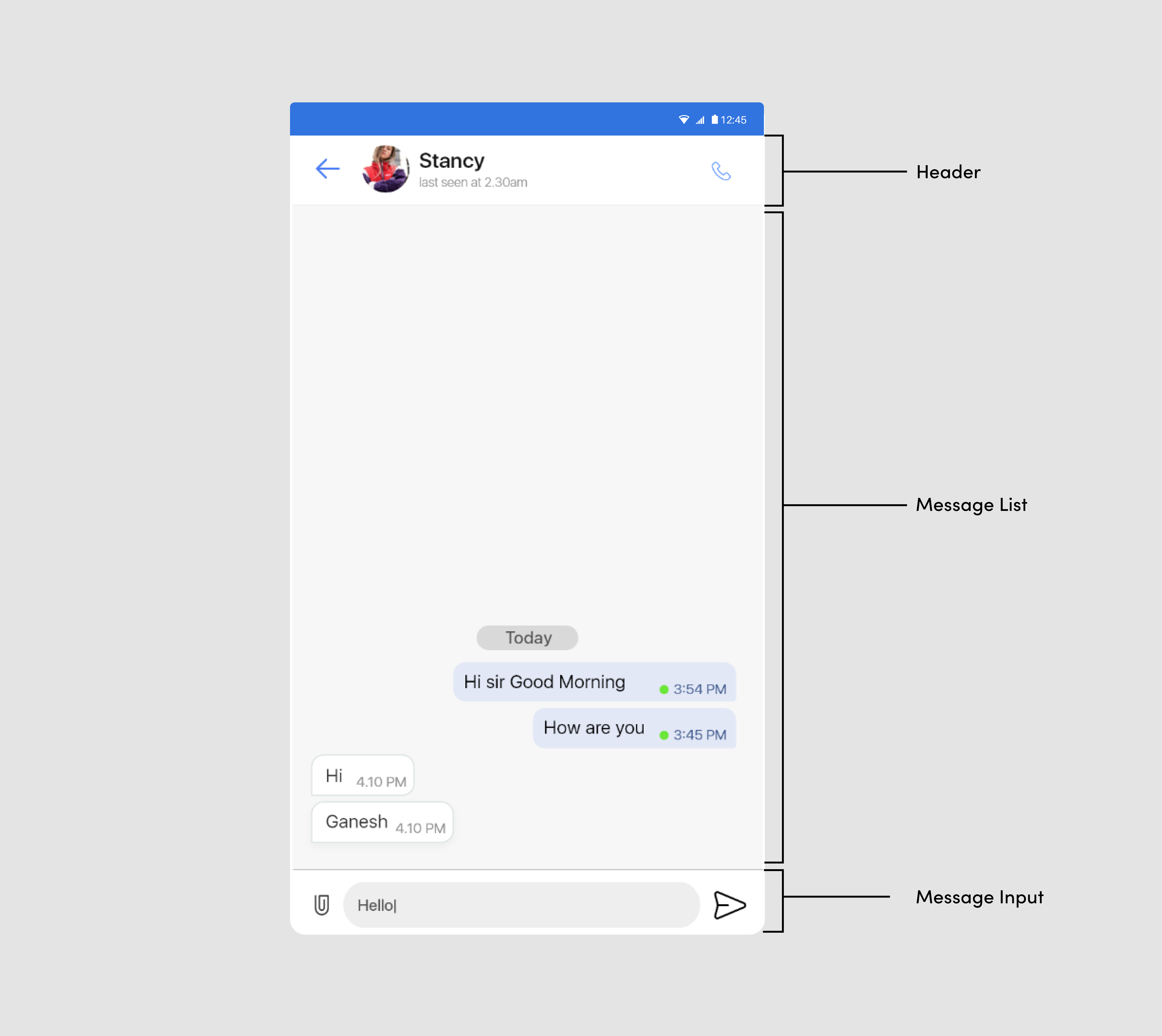
Light theme#

This is the default theme for UIKit if another theme hasn’t been specified.
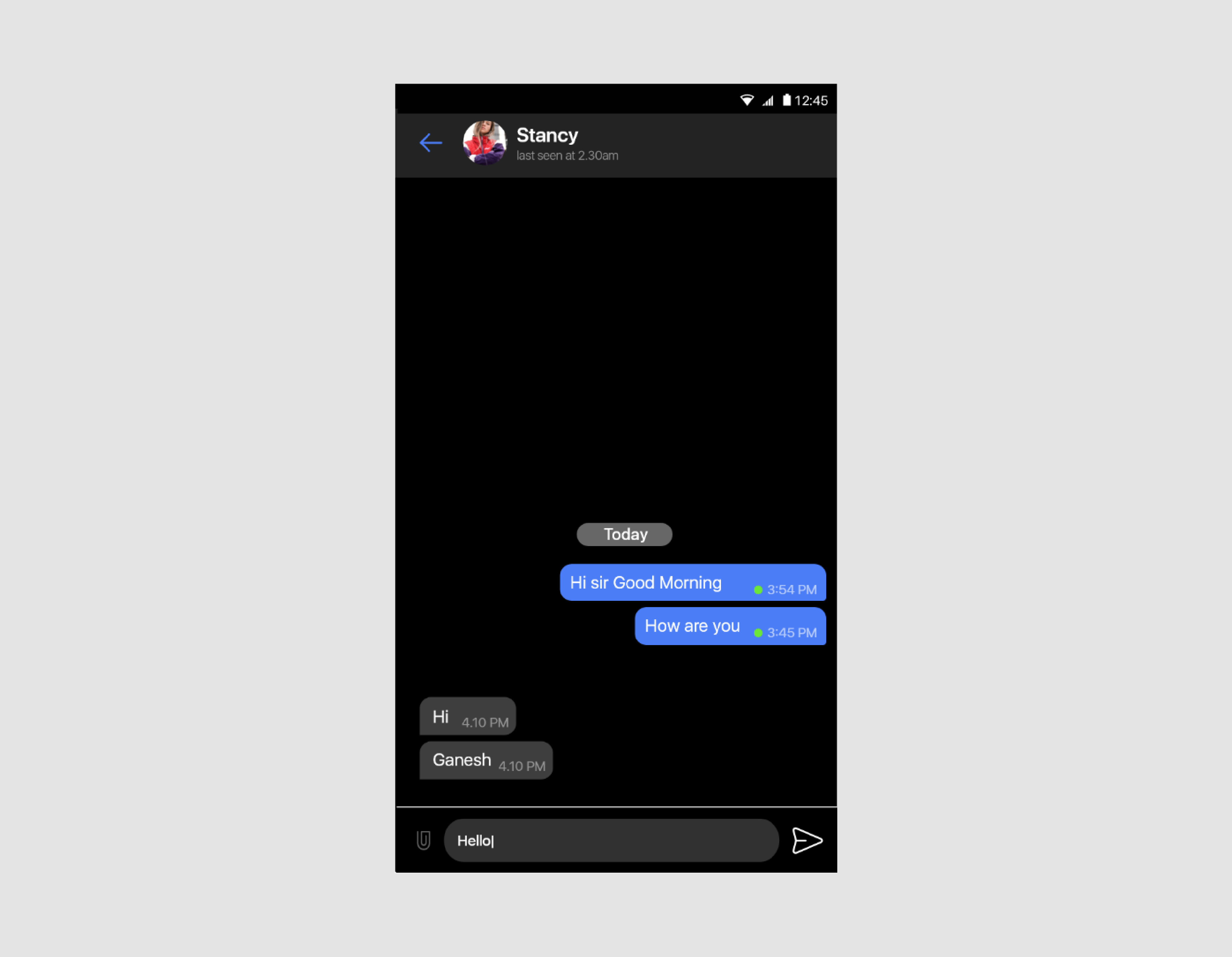
class BaseApplication : Application() {
override fun onCreate() {
super.onCreate()
MirrorFlyUIKit.initFlySDK(applicationContext,object : MirrorFlyUIKitAdapter {
override fun getLicence(): String {
return YOUR_LICENCE_KEY
}
override fun getUserId(): String {
return USER_ID
}
})
MirrorFlyUIKit.defaultThemeMode = MirrorFlyUIKit.ThemeMode.Light
}
}

light-theme

Dark theme#

The Dark theme can be applied as below:

class BaseApplication : Application() {
override fun onCreate() {
super.onCreate()
MirrorFlyUIKit.initFlySDK(applicationContext,object : MirrorFlyUIKitAdapter {
override fun getLicence(): String {
return YOUR_LICENCE_KEY
}
override fun getUserId(): String {
return USER_ID
}
})
MirrorFlyUIKit.defaultThemeMode = MirrorFlyUIKit.ThemeMode.Dark
}
}

dark-theme

StyleSet#

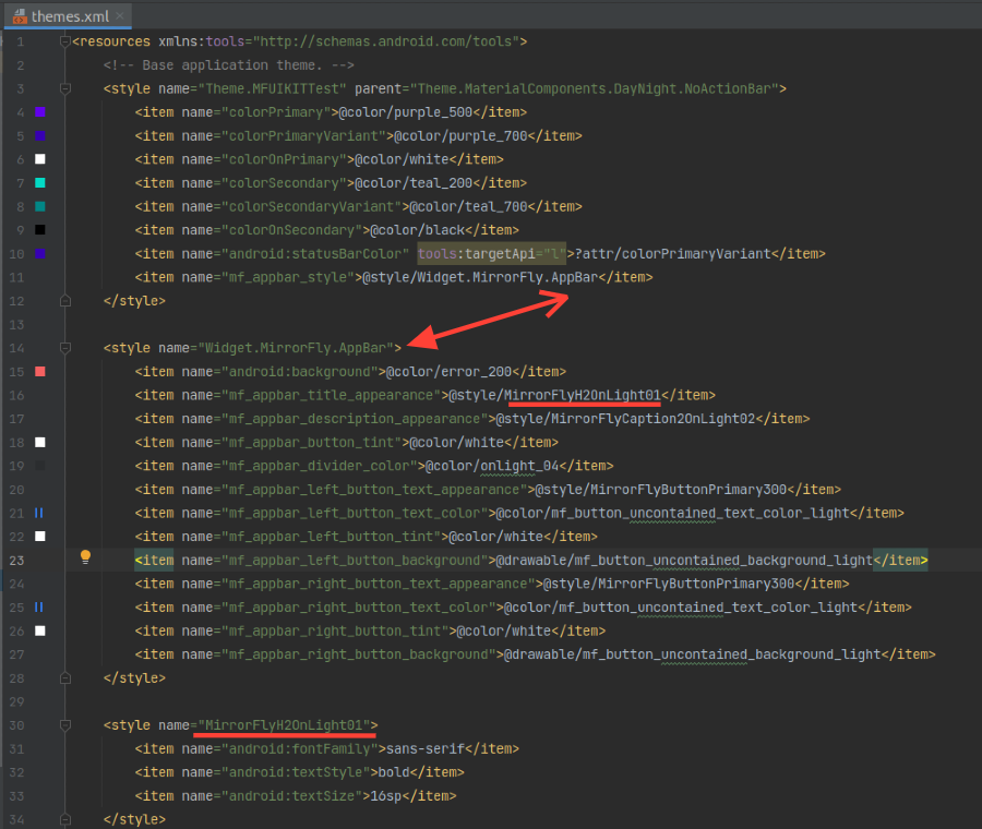
StyleSet is the list of styles provided by UIKit. Customizing the style of chat list items is straightforward: Simply inherit the UIKit-defined styles, then override the res/values/styles.xml or res/values/themes.xml file from the list below. For example, the ChatPreview theme can be changed by overriding the Widget.MirrorFly.ChatPreview.

<style name="MirrorFly" parent="AppTheme">
<item name="mf_chat_preview_style">@style/Widget.MirrorFly.ChatPreview</item>
<item name="mf_message_user_style">@style/Widget.MirrorFly.Message.User</item>
<item name="mf_message_input_style">@style/Widget.MirrorFly.MessageInput</item>
<item name="mf_dialog_view_style">@style/Widget.MirrorFly.RecyclerView.Message</item>
<item name="mf_appbar_style">@style/Widget.MirrorFly.AppBar</item>
<item name="mf_recycler_view_style">@style/Widget.MirrorFly.RecyclerView</item>
</style>

How to apply styleset#

apply-style-set

Chat Function Description#

The following table lists the style components of each Activity or Fragment used.

Activity or FragmentStyle components
FlyRecentChat (Recent Chats)Widget.MirrorFly.ChatPreview Widget.MirrorFly.RecyclerView Widget.MirrorFly.SelectContactTypeView
FlyChat (Single & Group Chat)Widget.MirrorFly.RecyclerView.Message Widget.MirrorFly.Message.User Widget.MirrorFly.Message.Timeline Widget.MirrorFly.MessageInput
ContactsWidget.MirrorFly.UserPreview Widget.MirrorFly.RecyclerView
AttachmentsWidget.MirrorFly.AppBar Widget.MirrorFly.MessageInput
Message ForwardWidget.MirrorFly.UserPreview Widget.MirrorFly.RecyclerView
Message ReceiptsWidget.MirrorFly.MessageInfo Widget.MirrorFly.GroupMessageInfoHeader Widget.MirrorFly.GroupMessageInfoChild
ProfileWidget.MirrorFly.MyProfile
CommonComponentsWidget.MirrorFly.AppBar Widget.MirrorFly.RecyclerView Widget.MirrorFly.DialogView Widget.MirrorFly.StatusFrame

ColorSet#

The ColorSet is the set of colors provided by UIKit for Android and is fully customizable.

<?xml version="1.0" encoding="utf-8"?>
<resources>
<color name="primary_500">#491389</color>
<color name="primary_400">#6211c8</color>
<color name="primary_300">#742ddd</color>
<color name="primary_200">#c2a9fa</color>
<color name="primary_100">#dbd1ff</color>
<color name="secondary_500">#066858</color>
<color name="secondary_400">#027d69</color>
<color name="secondary_300">#259c72</color>
<color name="secondary_200">#69c085</color>
<color name="secondary_100">#a8e2ab</color>
<color name="error_500">#9d091e</color>
<color name="error_400">#bf0711</color>
<color name="error_300">#de360b</color>
<color name="error_200">#f66161</color>
<color name="error_100">#fdaaaa</color>
<color name="background_700">#000000</color>
<color name="background_600">#161616</color>
<color name="background_500">#2c2c2c</color>
<color name="background_400">#393939</color>
<color name="background_300">#bdbdbd</color>
<color name="background_200">#e0e0e0</color>
<color name="background_100">#eeeeee</color>
<color name="background_50">#ffffff</color>
<color name="overlay_01">#8c000000</color>
<color name="overlay_02">#51000000</color>
<color name="onlight_01">#e1000000</color>
<color name="onlight_02">#80000000</color>
<color name="onlight_03">#61000000</color>
<color name="onlight_04">#1e000000</color>
<color name="ondark_01">#e1ffffff</color>
<color name="ondark_02">#80ffffff</color>
<color name="ondark_03">#61ffffff</color>
<color name="ondark_04">#1effffff</color>
<color name="information">#adc9ff</color>
</resources>