Contacts
Create a fragment#
UIKit’s ContactFragment class extends the
Fragment
class and is designed to take up the whole screen of the activity. It is recommended to create this fragment in the onCreate() method of the user-generated activity. By default, the header of the create a chat view isn’t visible when using the ContactFragment.
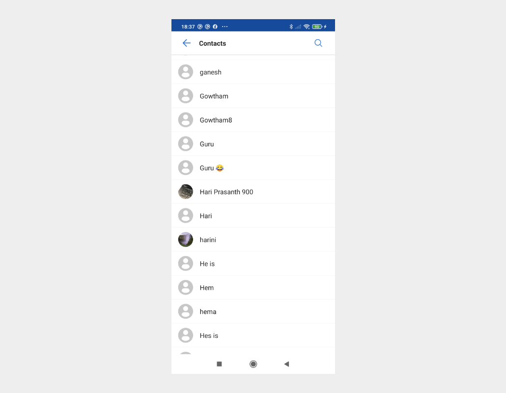
Contact Screen#
Overridable method#
UIKit provides methods that can be overridden so that you can customize your UI.
| Method | Return type | Description |
|---|---|---|
| createContactFragment() | ContactFragment | Called when the ContactActivity is created. |
Build the fragment#
The CreateContactFragment class enables you to customize the UI of your contact view. As shown below, the fragment class is composed of two regions: the header and user list:
Fragment regions#
| Region | Description |
|---|---|
| Header | Acts as an optional ActionBar in the contact activity. By default, it displays the title and buttons on the left, which are all customizable. If the left button is clicked, the finish() method of the activity will be called to close the current activity. |
| User list | Consists of each user’ profile image and nickname. By default, all users registered to the particular licence key in the Mirrorfly UIKIT application are retrieved and shown here. |
Set the fragment.builder()#
The ContactFragment.Builder class provides APIs that enable you to create a customized ContactFragment. Before building, the ContactFragment’s settings can be customized using the builder’s setters. The chat type of a contact can be determined in the SelectChatTypeView layout of the FlyRecectChatActivity. Refer to the following sample code to build the ContactFragment.
List of setter methods#
| Setter method | Description |
|---|---|
| Builder | Displays the chat types you can select. (Default : normal) |
| setCustomContactFragment() | Applies CustomContactFragment to ContactFragment. By inheritance, CustomContactFragment should be a subclass of ContactFragment. |
| setUserHeader() | Determines whether the header is used. |
| setHeaderTitle() | Specifies the title of the header. (Default: Contact) |
| setUseHeaderLeftButton() | Determines whether the left button of the header is used. (Default: true) |
| setHeaderLeftButtonIconResId() | Specifies the icon on the left button of the header. (Default: icon_arrow_left) |
| setHeaderLeftButtonIcon() | Specifies the icon and the tint on the left button of the header. (Default: icon_arrow_left, light mode : primary_300, dark mode : primary_200) |
| setHeaderLeftButtonListener() | Specifies the action of the click listener on the left button of the header. (Default: finish the current activity) |
| setContactListAdapter() | Specifies the user list adapter. (Default: UIKit's ContactListAdapter) |
Customize the style of contact items#
To customize the style of contact items, change the UIKit-defined style values in the res/values/themes.xml file. The table below shows the style of contact items you can customize. You need to keep the original names of the items and parents defined by the UIKit during the process.
List of attributes of Widget.MirrorFly.UserPreview#
| Attribute | Resource type | Description |
|---|---|---|
| android:background | drawable/color | The user item background. |
| mf_user_preview_nickname_appearance | text appearance | Size, color, font, and style of the user nickname. |
Note : To apply the declared custom styles, pass the
R.style.Customto theContactFragment.Builderas follows: