let stringSet = {
BANNER_HI_LABEL: "Hi",
BANNER_TEXT_WELCOME_MESSAGE: "Try the wholesome experience of MirrorFly",
BANNER_TEXT_CHATTING: "Chatting",
BANNER_TEXT_VOICE: "Voice",
BANNER_TEXT_VIDEO: "Video",
MENU_DROP_DOWN_NEW_GROUP: "New Group",
MENU_DROP_DOWN_SETTINGS: "Settings",
MENU_DROP_DOWN_THEMES: "Theme",
MENU_DROP_DOWN_LOGOUT: "Log Out",
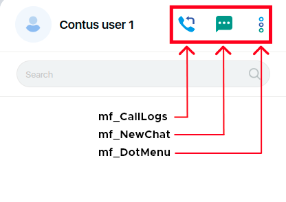
CALL_LOG_ICON_LABEL: "Call logs",
NEW_CHAT_ICON_LABEL: "New chat",
MORE_OPTIONS_ICON_LABEL: "More options",
DARK_THEME_LABEL: "Dark Theme",
LIGHT_THEME_LABEL: "light Theme",
NO_SEARCH_CONTACT_FOUND: "No contacts found",
NO_RESULTS_FOUND: "No results found",
NO_SEARCH_CHAT_CONTACT_FOUND: "No chats or contacts found",
CALL_LINK_COPIED: "Call Link Copied",
MAXIMUM_USERS_IN_CALL: "Maximum {maxUsers} members allowed in a call",
PROFILE_UPDATE_SUCCESS: "Profile updated successfully",
MESSAGE_COPIED_SUCCESSFULLY: "Message Copied Successfully",
NO_INTERNET_CONNECTION: "Please check your Internet connection",
SEARCH_INPUT_PLACE_HOLDER: "Search",
YOU_TEXT_LABEL: "You",
TODAY_LABEL_TEXT: "Today",
YESTERDAY_LABEL_TEXT: "Yesterday",
ONLINE_LABEL_TEXT: "Online",
MESSAGE_SELECTED: "Selected",
FORWARD_SINGLE_MESSAGE_HEADER: "Forward message to",
FORWARD_MULTIPLE_MESSAGES_HEADER: "Forward messages to",
RECENT_CHAT_LABEL: "Recent Chat",
YOU_ARE_ALREADY_IN_CALL: "You are already in call",
NO_CONVERSATION: "There is no conversation.",
LAST_SEEN_TODAY: "last seen today at {time}",
LAST_SEEN_YESTERDAY: "last seen yesterday at {time}",
LAST_SEEN_WITH_IN_WEEK: "last seen on {day} at {time}",
LAST_SEEN_MORE_THAN_WEEK_DATE_ABOVE_0: "last seen {date}-{month}-{year}",
LAST_SEEN_MORE_THAN_WEEK_DATE_BELOW_0: "last seen {zero}{date}-{month}-{year}",
DOWNLOAD_TITLE_LABEL: "Download",
CLOSE_TITLE_LABEL: "Close",
REMOVE_TITLE_LABEL: "Remove",
BACK_TITLE_LABEL: "Back",
CONNECTION_STATE_CONNECTING: "CONNECTING",
NEW_CHAT_HEADER_LABEL: "New chat",
NEW_GROUP_HEADER_LABEL: "New Group",
NEW_GROUP_NEXT_BUTTON: "Next",
PROVIDE_GROUP_NAME_ERROR: "Please provide group name",
CREATE_GROUP_TITLE_LABEL: "Create group",
NEW_GROUP_NAME_INPUT_PLACEHOLDER: "Type group name here...",
ADD_GROUP_PARTICIPANTS: "Add Group Participants",
CONTACTS_LABEL: "Contacts",
CALL_NOW: "Call now",
GROUP_CREATED_BY_YOU: "You created this group",
GROUP_CREATED_BY_PUBLISHER: "{publisherName} created this group",
GROUP_YOU_ADDED: "You added {toUser}",
GROUP_ADDED_BY_PUBLISHER: "{publisherName} added {toUser}",
GROUP_PUBLISHER_ADDED_YOU: "{publisherName} added you",
GROUP_YOU_LEFT: "You left",
GROUP_PUBLISHER_LEFT: "{userName} left",
GROUP_USER_REMOVED: "You removed {userName}",
GROUP_PUBLISHER_REMOVED_YOU: "{userName} removed you",
GROUP_MEMBERS_REMOVED: "{publisherName} removed {toUser}",
YOU_UPDATED_GROUP_PROFILE: "You updated this group profile",
PUBLISHER_UPDATED_GROUP_PROFILE: "{publisherName} updated this group profile",
YOU_ARE_NOW_AN_ADMIN: "You are now an admin",
USER_IS_NOW_AN_ADMIN: "{userName} is now an admin",
GROUP_INFO_HEADER: "Group info",
GROUP_NAME_NOT_EMPTY: "Group name cannot be empty",
EXIT_GROUP_LABEL: "Exit Group",
DELETE_GROUP_LABEL: "Delete Group",
GROUP_PARTICIPANT_LABEL: "Participants",
GROUP_ADD_PARTICIPANT_LABEL: "Add Participants",
REPORT_GROUP_LABEL: "Report Group",
MAKE_GROUP_ADMIN_LABEL: "Make admin",
REMOVE_GROUP_LABEL: "Remove from Group",
GROUP_ADMIN_LABEL: "Admin",
MAKE_ADMIN_TITLE_LABEL: "Make {displayName} an admin for this group?",
MAKE_GROUP_ADMIN_BUTTON: "Make group admin",
EXIT_GROUP_BUTTON: "Exit",
EXIT_GROUP_TITLE_LABEL: "Are you sure you want to Exit from the group ?",
REMOVE_GROUP_BUTTON: "Remove",
REMOVE_GROUP_TITLE_LABEL: "Remove {displayName} from this group?",
ADD_GROUP_PARTICIPANTS_POPUP_HEADER: "Add group participants",
SELECT_MINIMUM_TWO_CONTACT: "Select minimum of two contacts",
SELECT_MINIMUM_ONE_CONTACT: "Select minimum of one contact",
CALL_LOGS_HEADER_LABEL: "Call Logs",
NO_CALL_LOG_HISTORY: "Oh snap It seems like they’re no call history!",
START_NEW_CALL: "Click on {icon} or Search to start a Call!",
NO_CALL_LOG_FOUND: "No call log history found",
ANY_NEW_CALL_LOG_INFO_APPEAR: "Any new calls will appear here",
USER_PROFILE_TITLE: "Profile",
USER_EMAIL_ADDRESS: "Email Address",
USER_MOBILE_NUMBER: "Mobile Number",
USER_PROFILE_INFO: "Profile image, name and status can be changed at anytime",
USER_VIEW_PHOTO: "View Photo",
USER_TAKE_PHOTO: "Take Photo",
USER_REMOVE_PHOTO: "Remove Photo",
USER_REMOVE_PROFILE_PHOTO_LABEL: "Remove your profile photo?",
USER_UPLOAD_PHOTO: "Upload Photo",
USER_CROP_PHOTO: "Drag and Adjust",
REMOVE_BUTTON: "Remove",
CANCEL_BUTTON: "Cancel",
EDIT_NAME_TITLE_LABEL: "Edit name",
EDIT_STATUS_TITLE_LABEL: "Edit status",
MESSAGE_INPUT_PLACE_HOLDER: "Start typing",
ATTACHMENT_ICON_LABEL: "Attachment",
RECORD_AUDIO_LABEL: "Record",
OKAY_BUTTON: "Okay",
ATTACHMENT_AUDIO_LABEL: "Audio",
ATTACHMENT_DOCS_LABEL: "Document",
ATTACHMENT_PHOTO_LABEL: "Photo",
ATTACHMENT_VIDEO_LABEL: "Video",
MEDIA_PREVIEW_HEADER: "Preview",
MEDIA_CAPTION_INPUT_PLACE_HOLDER: "Add a caption",
MEDIA_PREVIEW_ADD_FILE_LABEL: "ADD FILE",
CHAT_HEADER_AUDIO_CALL_LABEL: "Audio Call",
CHAT_HEADER_VIDEO_CALL_LABEL: "Video Call",
GROUP_INFO_LABEL: "click here for group info",
CHAT_DROP_DOWN_REPLY_LABEL: "Reply",
CHAT_DROP_DOWN_FORWARD_LABEL: "Forward",
CHAT_DROP_DOWN_DELETE_LABEL: "Delete",
CHAT_DROP_DOWN_MESSAGE_INFO_LABEL: "Message Info",
CHAT_DROP_DOWN_MEDIA_DOWNLOAD_LABEL: "Download",
CHAT_DROP_DOWN_COPY_LABEL: "Copy",
CHAT_DROP_DOWN_REPORT_LABEL: "Report",
USER_NO_LONGER_AVAILABLE: "This user is no longer available",
BLOCKED_TEXT_LABEL: "You can't send message to this blocked contact.",
CANNOT_REPORT_DELETED_USER: "Cannot report deleted user",
CANNOT_REPORT_DELETED_USER_MESSAGE: "Cannot report deleted user's message",
ATTACHMENT_RETRY_LABEL: "Retry",
FILE_DOES_NOT_EXISTS: "File doesn't exists",
THIS_MESSAGE_WAS_DELETED: "This message was deleted",
YOU_DELETED_THIS_MESSAGE: "You deleted this message",
DELETE_SINGLE_MESSAGE_POPUP_TEXT_LABEL: "Are you sure you want to delete selected message",
DELETE_MULTIPLE_MESSAGES_POPUP_TEXT_LABEL: "Are you sure you want to delete selected messages",
DELETE_FOR_ME_BUTTON: "Delete For Me",
DELETE_FOR_EVERYONE_BUTTON: "Delete For Everyone",
MESSAGE_INFO_HEADER: "Message info",
MESSAGE_INFO_NO_ONE_IS_READ_YET: "No one is read yet",
MESSAGE_INFO_NO_MESSAGE_DELIVERED_YET: "No message delivered yet",
MESSAGE_INFO_DELIVERED_TO: "Delivered to {members} of {totalMembers}",
MESSAGE_INFO_READ_BY: "Read by {members} of {totalMembers}",
REPLY_AUDIO_MESSAGE_TYPE: "Audio",
REPLY_VIDEO_MESSAGE_TYPE: "Video",
REPLY_IMAGE_MESSAGE_TYPE: "Photo",
REPLY_LOCATION_MESSAGE_TYPE: "Location",
CONTACT_INFO_HEADER: "Contact info",
CONTACT_INFO_EMAIL_AND_PHONE_NUMBER: "Email and phone number",
MEDIA_AND_DOCS_LABEL: "Media and Docs",
NO_MEDIA_FOUND_LABEL: "No Media Found",
MUTE_LABEL: "Mute",
BLOCK_CONTACT_LABEL: "Block Contact",
UNBLOCK_CONTACT_LABEL: "Unblock Contact",
CLEAR_CHAT_LABEL: "Clear Chat",
DELETE_CHAT_LABEL: "Delete Chat",
REPORT_USER_LABEL: "Report",
CLEAR_CHAT_POPUP_HEADER: "Are you sure you want to Clear the chat",
DELETE_CHAT_POPUP_HEADER: "Are you sure you want to Delete the",
CLEAR_BUTTON: "Clear",
DELETE_BUTTON: "Delete",
NO_BUTTON: "No",
REPORT_BUTTON: "Report",
REPORT_SINGLE_CHAT_INFO_LABEL:
"The last 5 messages from this contact will be forwarded to admin.This contact will not be notified.",
REPORT_GROUP_CHAT_INFO_LABEL:
"The last 5 messages from this group will be forwarded to admin.No one in this group will be notified.",
REPORT_MESSAGE_LABEL: `This message will be forwarded to admin.\nThis contact will not be notified.`,
BLOCK_HEADER_LABEL: "Block",
UNBLOCK_HEADER_LABEL: "Unblock",
BLOCK_BUTTON: "Block",
UNBLOCK_BUTTON: "Unblock",
UNBLOCK_INFO_LABEL:
"On unblocking, this contact will be able to call you or send messages to you.",
BLOCK_INFO_LABEL:
"On blocking, this contact will not be able to call you or send messages to you.",
SETTINGS_HEADER_TEXT: "Settings",
SETTINGS_CHAT_LABEL: "Chat",
CHAT_HEADER_TEXT: "Chat",
TRANSLATE_MESSAGE_LABEL: "Translate Message",
TRANSLATE_DESCRIPTION_MESSAGE:"Enable Translate Message to choose Translation Language",
TRANSLATE_CHOOSE_LANGUAGE:"Choose Translation Language",
TRANSLATE_CLICK_MESSAGE:"Click it to translate the message",
TRANSLATE_MOUSE_OVER_MESSAGE:"Mouse over received message chat bubble which displays Translate Message icon,",
SETTINGS_BLOCKED_LABEL: "Blocked",
SETTING_BLOCKED_HEADER_TEXT: "Blocked Contacts",
NO_BLOCK_CONTACT: "No Blocked Contacts Found",
SELECT_ANY_PARTICIPANT: "Please select any Participant",
TOAST_GROUP_NOT_AVAILABLE: "This group is no longer available",
TOAST_EXIT_GROUP: "You’re no longer participant in the group",
TOAST_REMOVE_GROUP: "{displayName} is removed from group",
TOAST_REQUEST_DECLINED: "Request declined",
TOAST_MAKE_ADMIN: "{displayName} is now admin",
TOAST_ALREADY_IN_CALL: "Can't place a new call while you're already in a call.",
TOAST_ANOTHER_CALL: `{displayName} is on another call`,
TOAST_BUSY_CALL: `{displayName} is busy`,
TOAST_PROFILE_PIC_REMOVED: "Profile picture removed successfully",
TOAST_USERNAME_TOO_SHORT: "Username is too short",
TOAST_MAXIMUM_FILE_COUNT: "Can't share more than {count} media items.",
TOAST_MAXIMUM_FILE_SIZE: "File size is too large. Try uploading file size below {size}MB",
TOAST_REPORT_SEND: "Report sent",
USER_LABEL:"User",
USER_HAS_BEEN_BLOCKED:"{displayName} has been blocked",
USER_HAS_BEEN_UNBLOCKED:"{displayName} has been unblocked",
NO_MESSAGES_TO_REPORT:"No Messages To Report",
COMMON_ERROR_MESSAGE: "Something went wrong. Please try again.",
MAXIMUM_AUDIO_RECORD_SEC: "You can record maximum 300 seconds for audio recording",
MINIMUM_AUDIO_RECORD_SEC: "Recorded audio time is too short",
NO_RESPONSE_CALL_SWITCH: `No response from {userName}`,
REQUEST_VIDEO_CALL: "Requesting to switch to video call.",
SWITCH_BUTTON: "SWITCH",
ACCEPT_BUTTON: "ACCEPT",
DECLINE_BUTTON: "DECLINE",
USER_REQUESTING_CALL_SWITCH: `{userName} Requesting to switch to video call`,
READY_TO_JOIN: "Ready to join",
JOIN_NOW: "Join Now",
TRY_AGAIN: "Try Again",
TRYING_TO_CONNECT: "Trying to connect",
USER_SEEMS_OFFLINE: "User seems to be offline, Trying to connect",
INVITE_PARTICIPANTS: "Invite Participants",
GROUP_CALL: "Group Call",
INCOMING_CALL_LABEL: "Incoming {callType}",
INCOMING_GROUP_CALL_LABEL: "Incoming Group {callType}",
ALL_MEMBERS_ALREADY_IN_CALL: "All members of your contacts are already in the call.",
NEW_MISSED_CALL: "New Missed Call",
NEW_INCOMING_CALL_NOTIFICATION_TITLE: "New Incoming Call",
MISSED_CALL_AUDIO_NOTIFICATION: `You missed an audio call`,
MISSED_CALL_VIDEO_NOTIFICATION: `You missed a video call`,
MISSED_GROUP_AUDIO_CALL_NOTIFICATION: "You missed group audio call",
MISSED_GROUP_VIDEO_CALL_NOTIFICATION: "You missed group video call",
MUTE_UNMUTE_ICON_LABEL: "Mute / Unmute",
HANG_UP: "Hangup",
CAMERA_PERMISSION_DISABLED: "Camera Permission Disabled",
START_STOP_CAMERA: "Start / Stop Camera",
PARTICIPANT: "Participants",
MEMBER_LABEL: "member",
MEMBERS_LABEL: "members",
JOINED_LABEL: "joined",
LEFT_LABEL: "left",
MORE_USERS_LABEL: "{userList} and {length} more have ",
PARTICIPANT_STOPPED_CAMERA: "Participant has stopped the camera",
PARTICIPANT_MUTED: "Participant is muted",
RECENT_ONGOING_CALL_TEXT: "Ongoing {callType}",
RECENT_ONGOING_GROUP_CALL_TEXT: "Ongoing group {callType}",
TAP_TO_RETURN_TO_CALL: "Tap to return to call",
BACK_TO_CHAT: "Back to chat",
MICROPHONE_OFF: "Microphone off",
CAMERA_OFF: "Camera off",
CALL_SWITCH_REQUEST: "Are you sure you want to switch to Video call?",
CALL_BUSY_STATUS_MESSAGE: "User is busy",
CALL_ENGAGED_STATUS_MESSAGE: "Busy on another call",
CALL_HOLD_STATUS_MESSAGE: "Call on hold",
Reconnecting: "Reconnecting",
Connected: "Connected",
Disconnected: "Disconnected",
Ended: "Ended",
Connecting: "Connecting",
Calling: "Calling",
Busy: "Busy",
Engaged: "Engaged",
Ringing: "Ringing",
Hold: "Hold",
Attended: "Attended",
};