Single & Group Chat
Create a fragment#
UIKit’s FlyChatFragment class extends the
Fragment
class and is designed to take up the whole screen of the activity. It is recommended to create this fragment in the onCreate() method of the user-generated activity. By default, the header of the flychat view isn’t visible when using the FlyChatFragment.
Overridable method#
UIKit provides methods that can be overridden so that you can customize your UI.
| Method | Return type | Description |
|---|---|---|
| createFlyChatFragment() | FlyChatFragment | Called when the FlyChatActivity is created. |
Build the fragment#
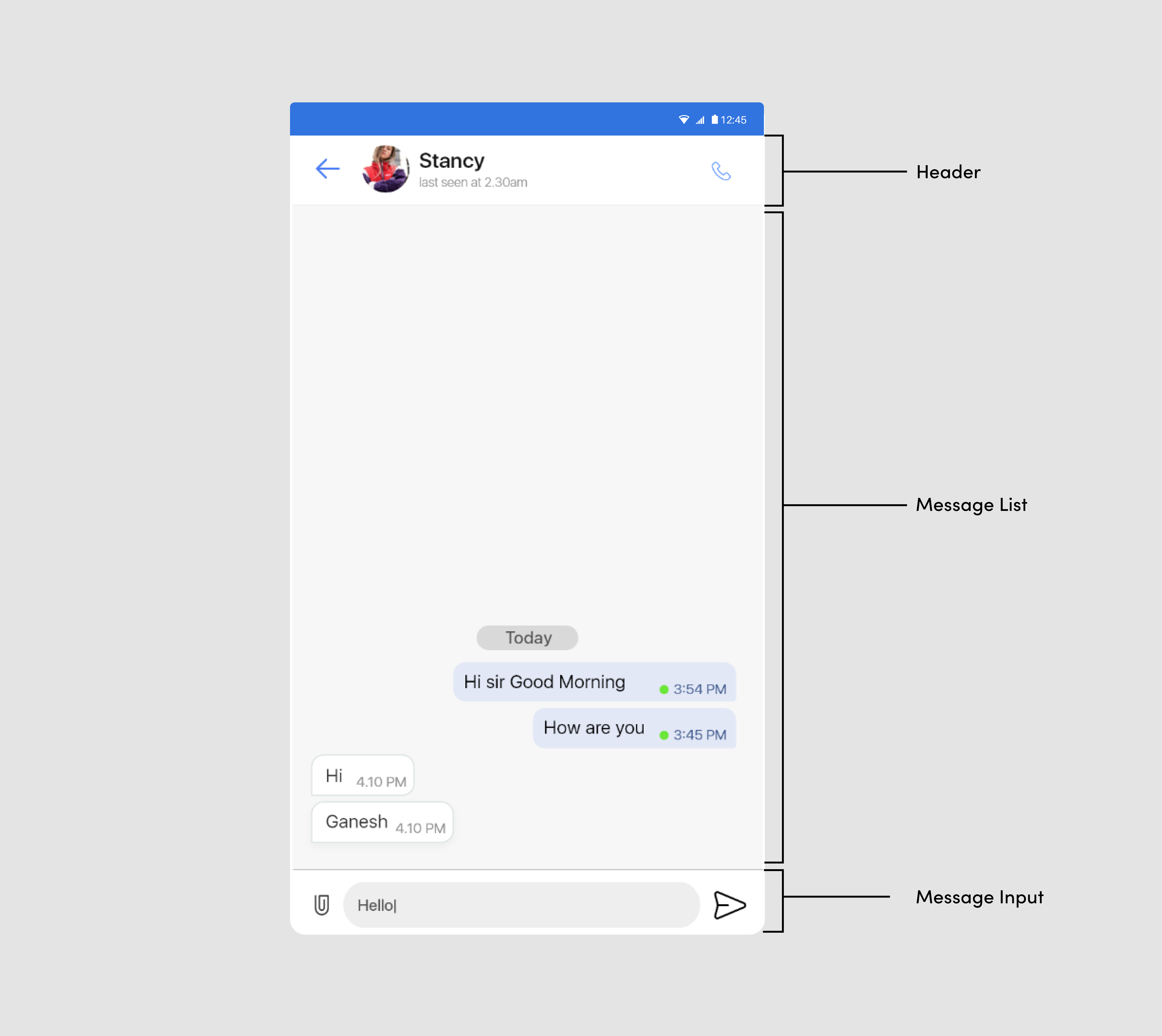
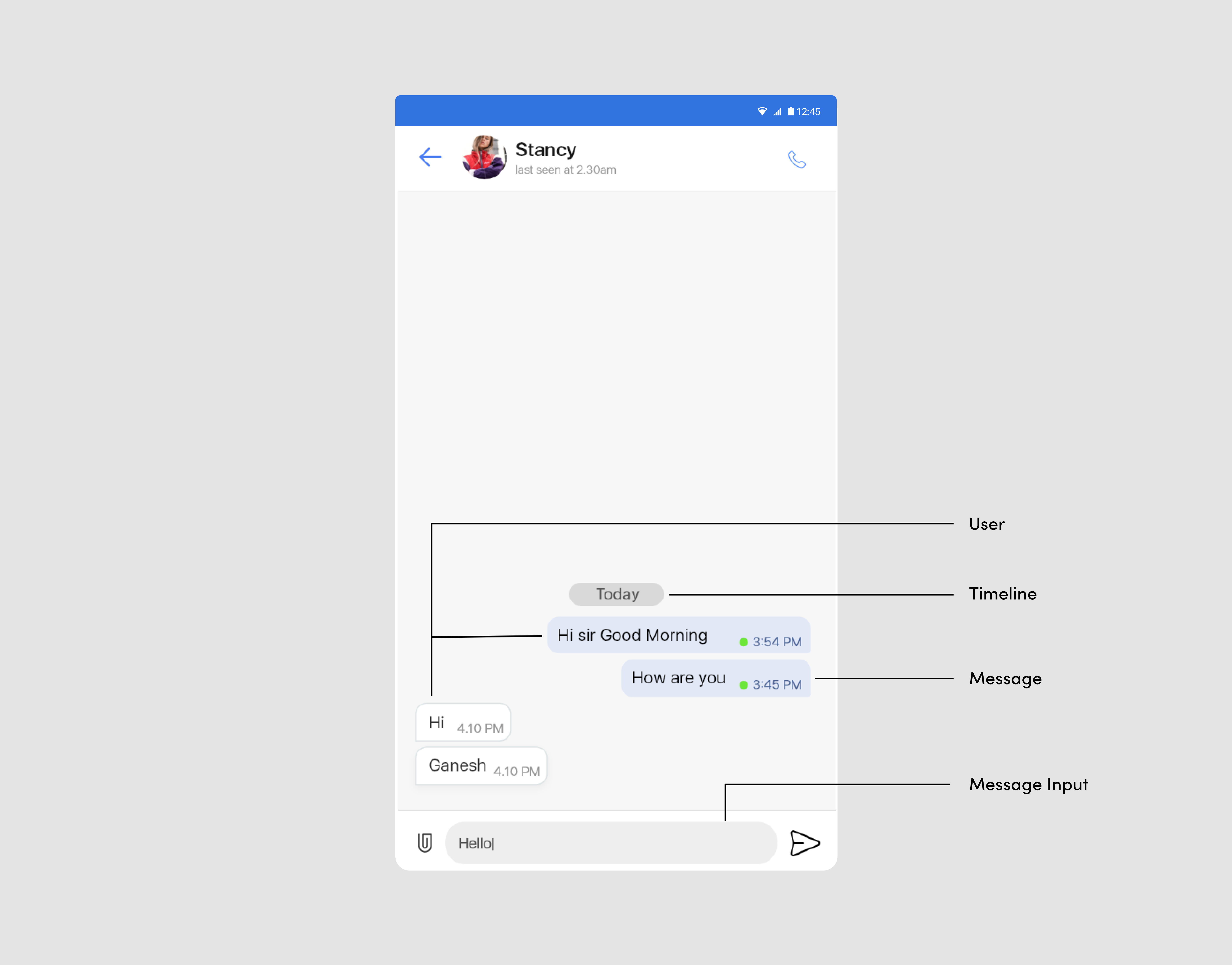
The FlyChatFragment class enables you to customize the UI of your fly chat view. As shown below, the fragment class is composed of three regions:Header,Message List,and Message Input Field.
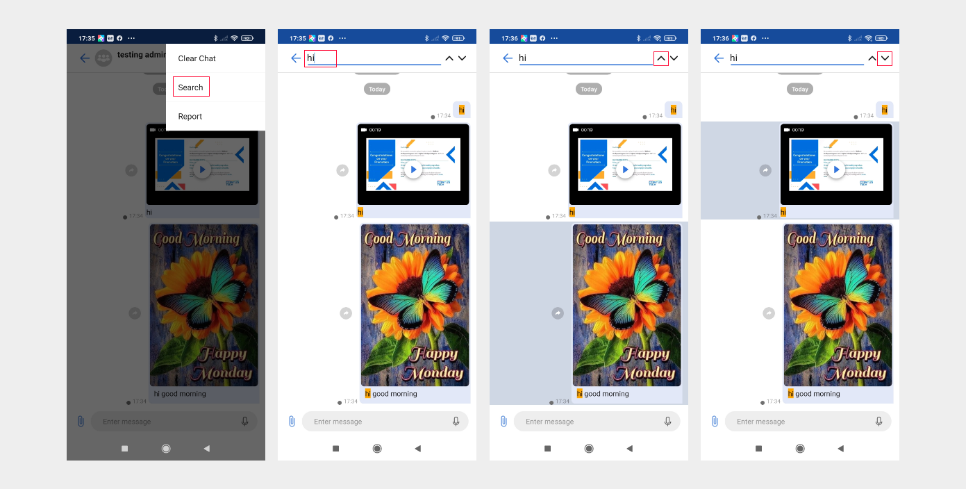
Search in chat screen#
Search is used to search a text message, image & video caption, contact name, audio and document title from chat screen. you can refer the below image.
Fragment regions#
| Region | Description |
|---|---|
| Header | Acts as an optional ActionBar in the activity. By default, it displays the chat cover image, chat name, which other users in the chat are currently typing a message, as well as two buttons on the left and right, which are all customizable and other user’s last seen time is also displayed. If the left button is clicked, the finish() method of the activity will be called to take the user to the fly recent chat of the FlyRecentChatActivity. |
| Message list | UIKit provides three different types of messages. Refer to the table below. |
| Message input field | Enables users to send a text message |
Set the fragment.builder()#
The FlyChatFragment.Builder class provides APIs that enable you to customize the FlyChatFragment fragment. The FlyChatFragment’s settings can be customized using the builder’s setters before building. The following is an example of how to build the fragment:
List of setter methods#
| Setter method | Description |
|---|---|
| setCustomFlyChatFragment() | Applies CustomFlyChatFragment to FlyChatFragment. By inheritance, CustomFlyChatFragment should be a subclass of FlyChatFragment. |
| setUserHeader() | Determines whether the header is used. (Default: calls from an activity: true, calls from a fragment: false) |
| setHeaderTitle() | Specifies the title of the header. (Default: chat name) |
| SettsetUseHeaderLeftButton() | Determines whether the left button of the header is used. (Default: true) |
| setUseHeaderRightButton() | Determines whether the right button of the header is used. (Default: true) |
| setUseTypingIndicator() | Determines whether the typing indicator is used. (Default: true) |
| setHeaderLeftButtonIconResId() | Specifies the icon on the left button of the header. (Default: icon_arrow_left) |
| setHeaderLeftButtonIcon() | Specifies the icon and the tint on the left button of the header. (Default: icon_arrow_left, light mode : primary_300, dark mode : primary_200) |
| setHeaderRightButtonIconResId() | Specifies the icon on the right button of the header. (Default: icon_info) |
| setHeaderRightButtonIcon() | Specifies the icon and the tint on the right button of the header. (Default: icon_info, light mode : primary_300, dark mode : primary_200) |
| setInputLeftButtonIconResId() | Specifies the icon on the left button of the input. (Default: icon_add ) |
| setInputRightButtonIcon() | Specifies the icon and the tint on the right button of the input. (Default: icon_send, light mode : primary_300, dark mode : primary_200) |
| setInputHint() | Specifies an input hint for the text input field. (Default: Enter message) |
| setHeaderLeftButtonListener() | Specifies the action of the click listener on the left button of the header. (Default: finish the current activity) |
| setHeaderRightButtonListener() | Specifies the action of the click listener on the right button of the header. (Default: start the ChatSettingsActivity) |
| setChatAdapter() | Specifies the message list adapter. (Default: UIKit's ChatAdapter) |
Customize the style of the fly chat#
To customize the style of chat items, change the UIKit-defined style values in the res/values/theme.xml file. The table below shows the style of chat items you can customize. You need to keep the original names of the items and parents defined by the UIKit during the process.
Attributes reference#
Note : To apply the declared custom styles, pass the
JIDandCHATTYPEof the fly chat and theR.style.Customto theFlyChatFragment.Builderconstructor as follows: