Light and Dark chat/Messaging App Theme Download
The Mirrorfly UI component is customizable on theme model. On a default Mirrorfly webchat app holds has 2 themes light and dark theme. Customized themes that fit your requirment can also be created by providing colorSet and iconSet.
Setup the default theme#
UIKit for web's Light or Dark theme can be changed using theme prop.
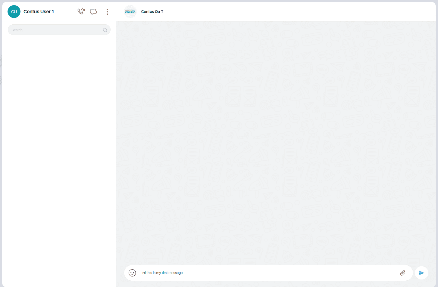
Light theme#
Light theme is a default theme which is rendered without the declaration of theme or passing theme='light'.
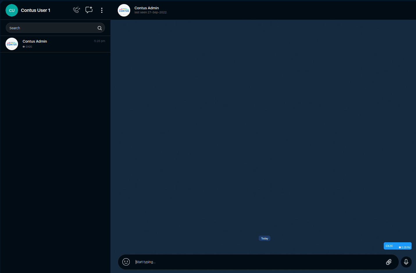
Dark theme#
The Dark theme can be applied by passing theme='dark' in ChatApp component
Basic colorSet Property#
colorSet Prop is a style property which is provided with the list of variables where the seperate component layouts color can be changed. On a basic level of colorSet object the colors of the component can be changed.
Changed colorSet Props#
Basic colorSet Variables#
The following table lists the style components of each Components used.
| Components | colorSet Variables |
|---|---|
| Chatapp Background Color | mfBoxLayoutBg |
| Overall Theme color | mfThemeColor |
| Bright theme color usage | mfThemeColorBright |
| Dark theme color usage | mfThemeColorDark |
| Theme color in rgb | mfThemeColorRgb |
| General All Heading BG color | mfHeadingBg |
| Chatapp Banner colorSet | mfBgcStartchatBannerLink |
ColorSet#
The ColorSet is the set of colors provided by UIKit for Web and is fully customizable.