Recent Chats | MirrorFly Chat - Android UI Kit Docs
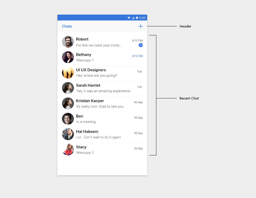
A Fly Recent chat is the complete list of recent chats that you're made with single conversation. The recent chat list is displayed once a connection with Mirrorfly server is established, and can be easily managed without complex implementation because the FlyRecentChatActivity or FlyRecentChatFragment class handles core features such as chat pagination and real-time updates.
Note : If search feature unavailable for your plan then it will not display in
FlyRecentChatFragment.
Start an activity#
Use the intent to move from one activity to the FlyRecentChatActivity as follows:
If you want to customize the recent chat activity, use CustomFlyRecentChatActivity as follows and Refer in advance Section for more details:
- Recent chat view
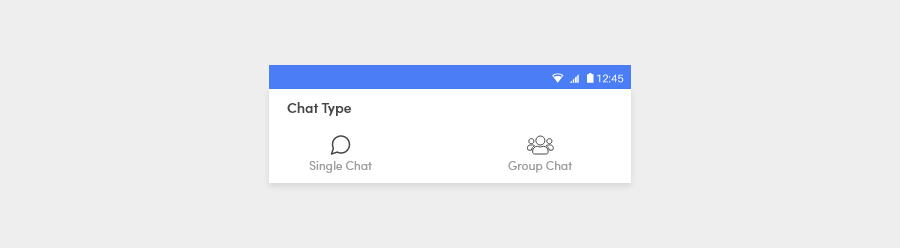
- Chat Type
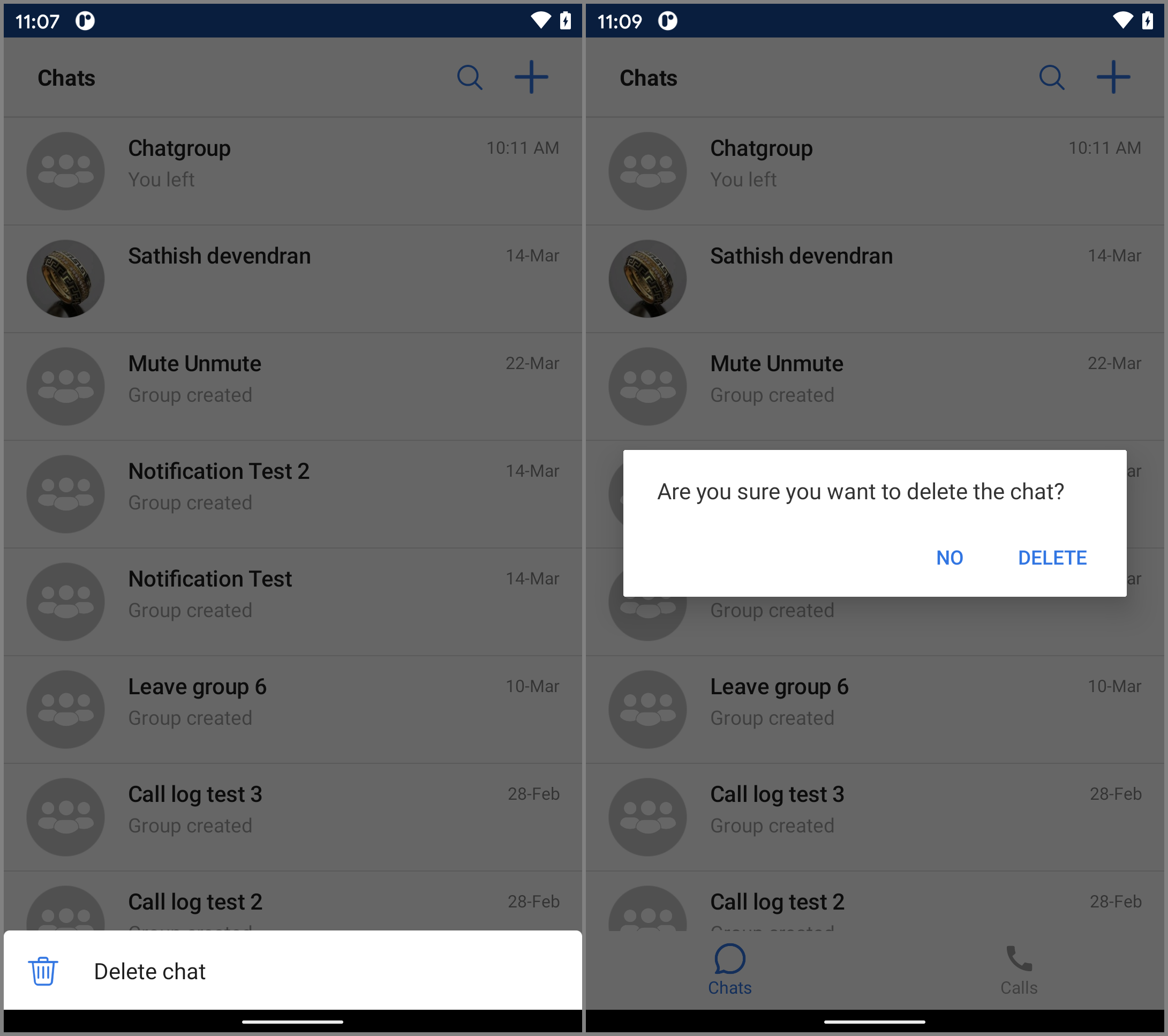
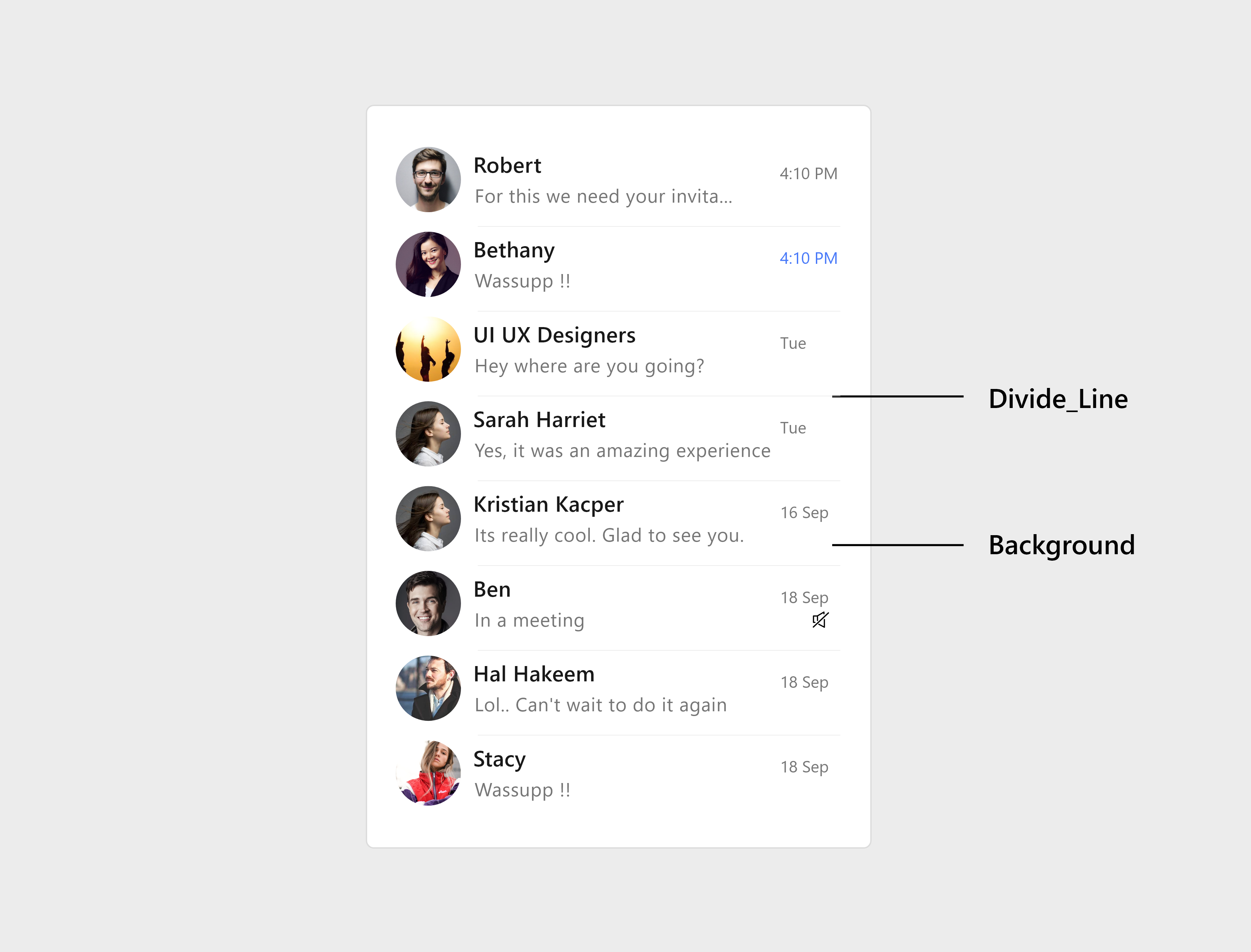
Delete Chat#
Note : If Delete Chat feature unavailable for your plan then it will not display in the
FlyRecentChatFragment.
To delete a recent chat of a user or a group they should long press the chat item.
StyleSet#
StyleSet is the list of styles provided by MirrorFly UIKit. Customizing the style of Recent Chat list items is straightforward: Simply inherit the MirrorFly UIKit-defined styles, then override the res/values/styles.xml or res/values/themes.xml file from the list below.
For example, the ChatPreview, AppBar, RecyclerView theme can be changed by overriding the Widget.MirrorFly.ChatPreview Widget.MirrorFly.AppBar Widget.MirrorFly.RecyclerView.
Listed below are all the Recent Chat style used in UIKit for Android. Styles can be changed by overwriting the res/values/styles.xml or res/values/themes.xml files with the same name.
List of attributes of Widget.MirrorFly.AppBar#
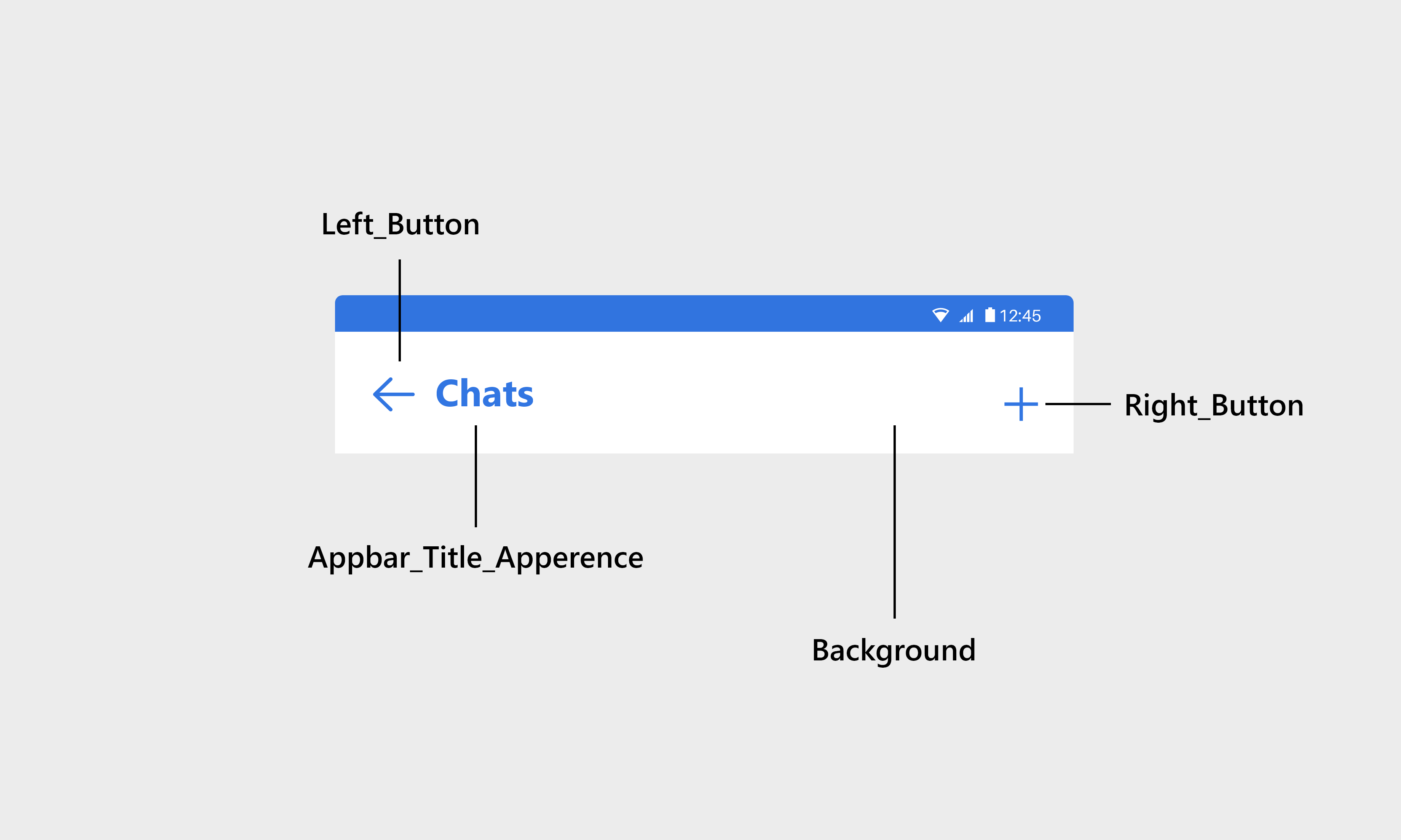
| Attribute | Resource type | Description |
|---|---|---|
| android:background | drawable/color | The background of the header. |
| mf_appbar_title_appearance | text appearance | The text size, color, font, and style of the header title. |
| mf_appbar_description_appearance | text appearance | The text size, color, font, and style of the header description. The header description is used to show the typing indicator and the time of when a user has last seen. |
| mf_appbar_button_tint | color | The color of the buttons. |
| mf_appbar_divider_color | color | The color of the line divider located at the bottom. |
| mf_appbar_left_button_text_appearance | text appearance | The text size, color, font, and style of the left button. |
| mf_appbar_left_button_text_color | color | The text color of the left button. |
| mf_appbar_left_button_tint | color | The color of the left button. |
| mf_appbar_left_button_background | drawable/color | The background of the left button. |
| mf_appbar_right_button_text_appearance | text appearance | The text size, color, font, and style of the right button. |
| mf_appbar_right_button_text_color | color | The text color of the right button. |
| mf_appbar_right_button_tint | color | The color of the right button. |
| mf_appbar_right_button_background | drawable/color | The background of the right button. |
| mf_appbar_search_button_icon | drawable | The icon of the search button. |
| mf_appbar_search_cancel_button_icon | drawable | The icon of the close search button. |
| mf_appbar_search_text_color | color | The text color of the search button. |
| mf_appbar_search_button_hint | text | The hint text of the search button. |
| mf_appbar_search_text_appearance | text appearance | The text size, color, font, and style of the search text. |
List of attributes of Widget.MirrorFly.RecyclerView#
| Attribute | Resource type | Description |
|---|---|---|
| android:background | drawable/color | The background of the RecyclerView. |
| mf_pager_recycler_view_use_divide_line | boolean | Determines whether to use line dividers between messages. |
| mf_pager_recycler_view_divide_line_color | color | The color of the line divider. |
| mf_pager_recycler_view_divide_line_height | size | The height of the line divider. |
| mf_pager_recycler_view_divide_margin_left | size | The width of the empty space to the left of the line divider. |
| mf_pager_recycler_view_divide_margin_right | size | The width of the empty space to the right of the line divider. |
List of attributes of Widget.MirrorFly.ChatPreview#
| Attribute | Resource type | Description |
|---|---|---|
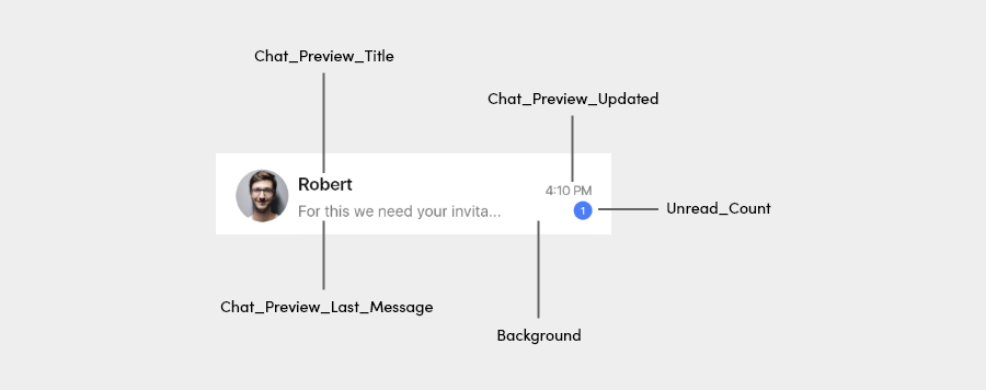
| android:background | drawable/color | The background of the ChatPreview. |
| mf_chat_preview_title_appearance | text appearance | The size, color, font, and style of text of the chat name. |
| mf_chat_preview_updated_at_appearance | text appearance | The size, color, font, and style of text of the number indicating the time the chat was last updated at. |
| mf_chat_preview_unread_count_appearance | text appearance | The size, color, font, and style of text of the number indicating the number of unread messages. |
| mf_chat_preview_last_message_appearance | text appearance | The size, color, font, and style of text of the last message sent in the chat. |
StringSet#
Listed below are all the strings used in UIKit for Android. Strings can be changed by overwriting the res/values/strings.xml files with the same name.
IconSet#
Listed below are all the icons used in UIKit for Android. Icons can be changed by overwriting the res/drawable files with the same name.
| Icon name | Image | Description |
|---|---|---|
| icon_create |  | Select the chat type. |
| icon_arrow_left |  | Goes back to the previous page. |
| icon_chat |  | An icon of chat |
| ic_menu_delete |  | To delete the chat |
| mf_shape_unread_message_count.xml | To change unread count background : Light | |
| mf_shape_unread_message_count_dark.xml | To change unread count background : Dark |