Group audio/video Call
Group audio and video call is a feature that allows users to communicate between group of members throught audio and video call. Group audio and video call appears in the
DashBoardActivity class.
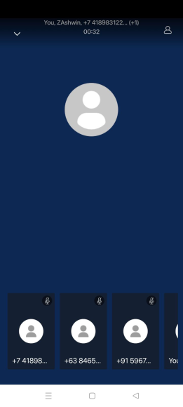
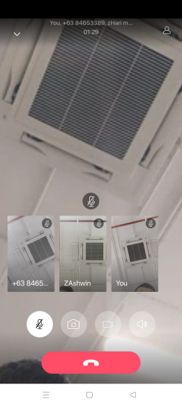
In MirrorFly UIKit for Android, there are currently two type of calls that users can Communicate : audio and video. These audio and video call can be communicate with other members in the single chat and group chat.
Group Audio Screen#
Group Video Screen#
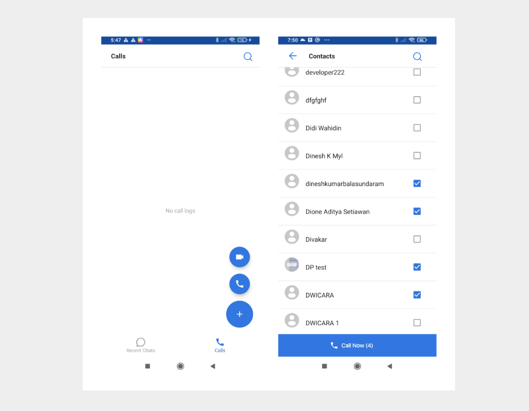
Group Call Flow#
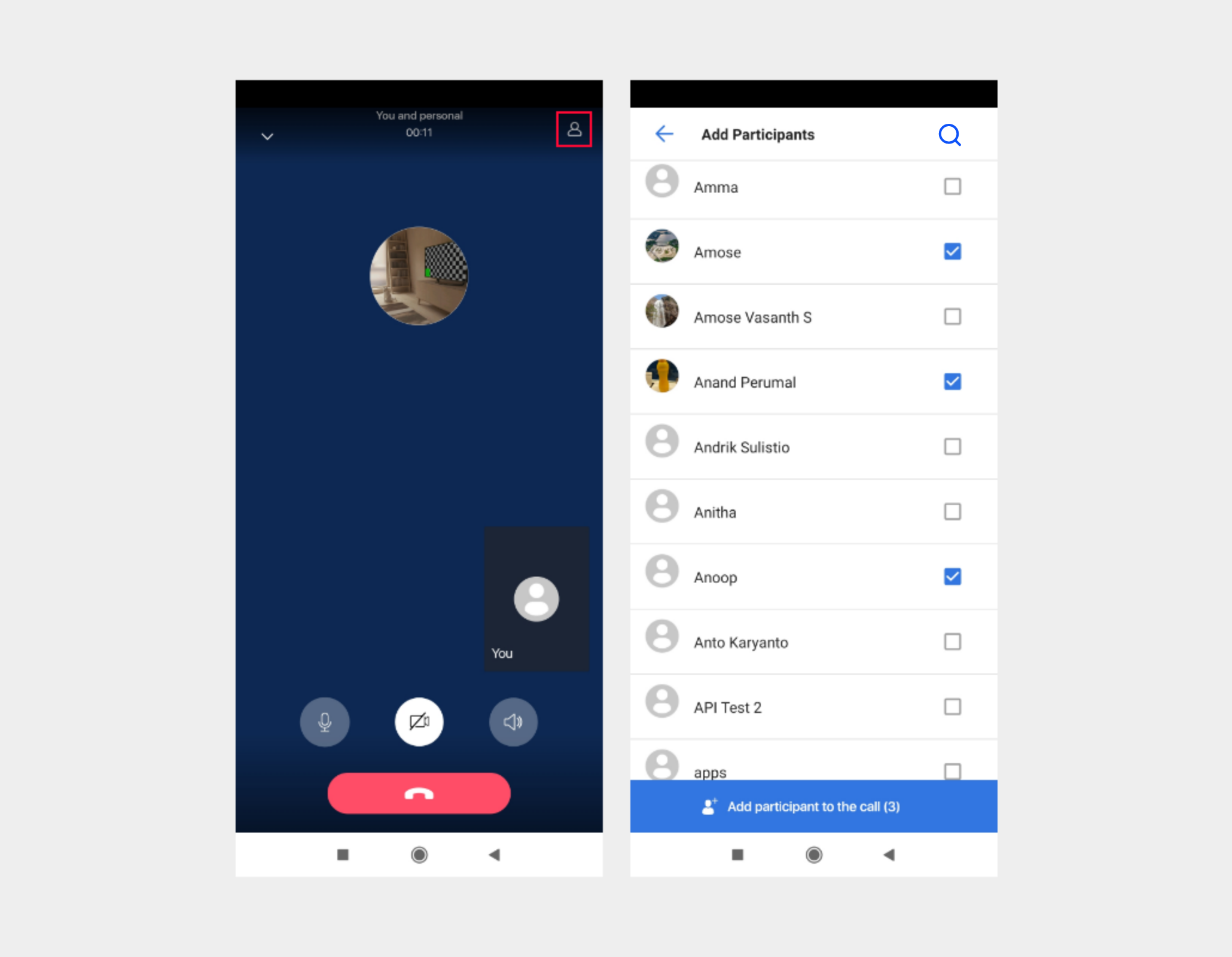
Add participants Flow#
After call is connected, you can able to add users to the ongoing call. once they accepted the incoming call, they will join in the ongoing call.
The following are the user selection AppBar style and attributes for customizations.#
The following are the user selection Recyclerview style and attributes for customizations.#
Customize the style of user selection items#
To customize the style of selection items, change the UIKit-defined style values in the res/values/themes.xml file. The table below shows the style of user selection items you can customize. You need to keep the original names of the items and parents defined by the UIKit during the process.
List of attributes of Widget.MirrorFly.UserPreview#
| Attribute | Resource type | Description |
|---|---|---|
| android:background | drawable/color | The user item background. |
| mf_user_preview_nickname_appearance | text appearance | Size, color, font, and style of the user nickname. |
Note : To apply the declared group id
Group Jid,call_typeCallType.AUDIO_CALL || CallType.VIDEO_CALL, custom stylesR.style.Customto theContactFragment.Builderas follows: