Themes

A theme is style that’s applied to your enimport Tabs from '@theme/Tabs'; import TabItem from '@theme/TabItem';tire app, activity or view hierarchy rather than an individual view. By default, Mirrofly UIKit for Android provides two themes: Light and Dark. Customized themes that fit your brand identity can also be created by changing the style and color set.

Setup the default theme#

UIKit for Android's Light or Dark theme can be applied using the MirrorFlyUIKit.defaultThemeMode method.

Light theme#

This is the default theme for UIKit if another theme hasn’t been specified.
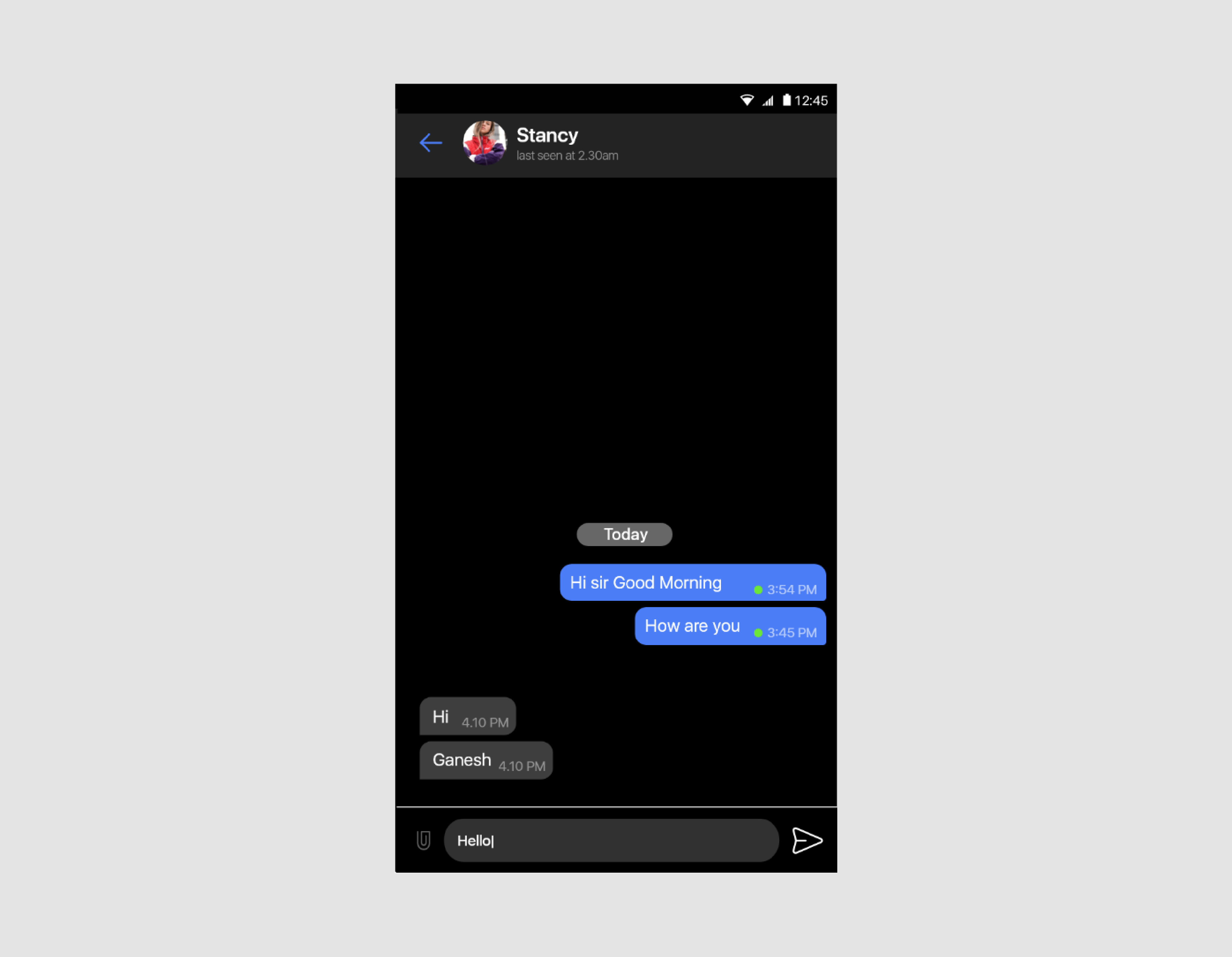
MirrorFlyUIKit.defaultThemeMode = MirrorFlyUIKit.ThemeMode.Light

light-theme

Dark theme#

The Dark theme can be applied as below:

MirrorFlyUIKit.defaultThemeMode = MirrorFlyUIKit.ThemeMode.Dark

dark-theme

StyleSet#

StyleSet is the list of styles provided by UIKit. Customizing the style of chat list items is straightforward: Simply inherit the UIKit-defined styles, then override the res/values/styles.xml file from the list below. For example, the ChatPreview theme can be changed by overriding the Widget.MirrorFly.ChatPreview.

Note : To apply our Dark theme, create a res/values/styles_dark.xml file and then add .Dark to the UIKit-defined style names.

<style name="MirrorFly" parent="AppTheme">
<item name="mf_chat_preview_style">@style/Widget.MirrorFly.ChatPreview</item>
<item name="mf_message_user_style">@style/Widget.MirrorFly.Message.User</item>
<item name="mf_message_input_style">@style/Widget.MirrorFly.MessageInput</item>
<item name="mf_chat_message_list_style">@style/Widget.MirrorFly.RecyclerView.Message</item>
<item name="mf_appbar_style">@style/Widget.MirrorFly.AppBar</item>
<item name="mf_recycler_view_style">@style/Widget.MirrorFly.RecyclerView</item>
<item name="mf_toast_view_style">@style/Widget.MirrorFly.ToastView</item>
</style>

Chat Function Description#

The following table lists the style components of each Activity or Fragment used.

Activity or FragmentStyle components
FlyRecentChatWidget.MirrorFly.ChatPreview, Widget.MirrorFly.RecyclerView, Widget.MirrorFly.SelectContactTypeView
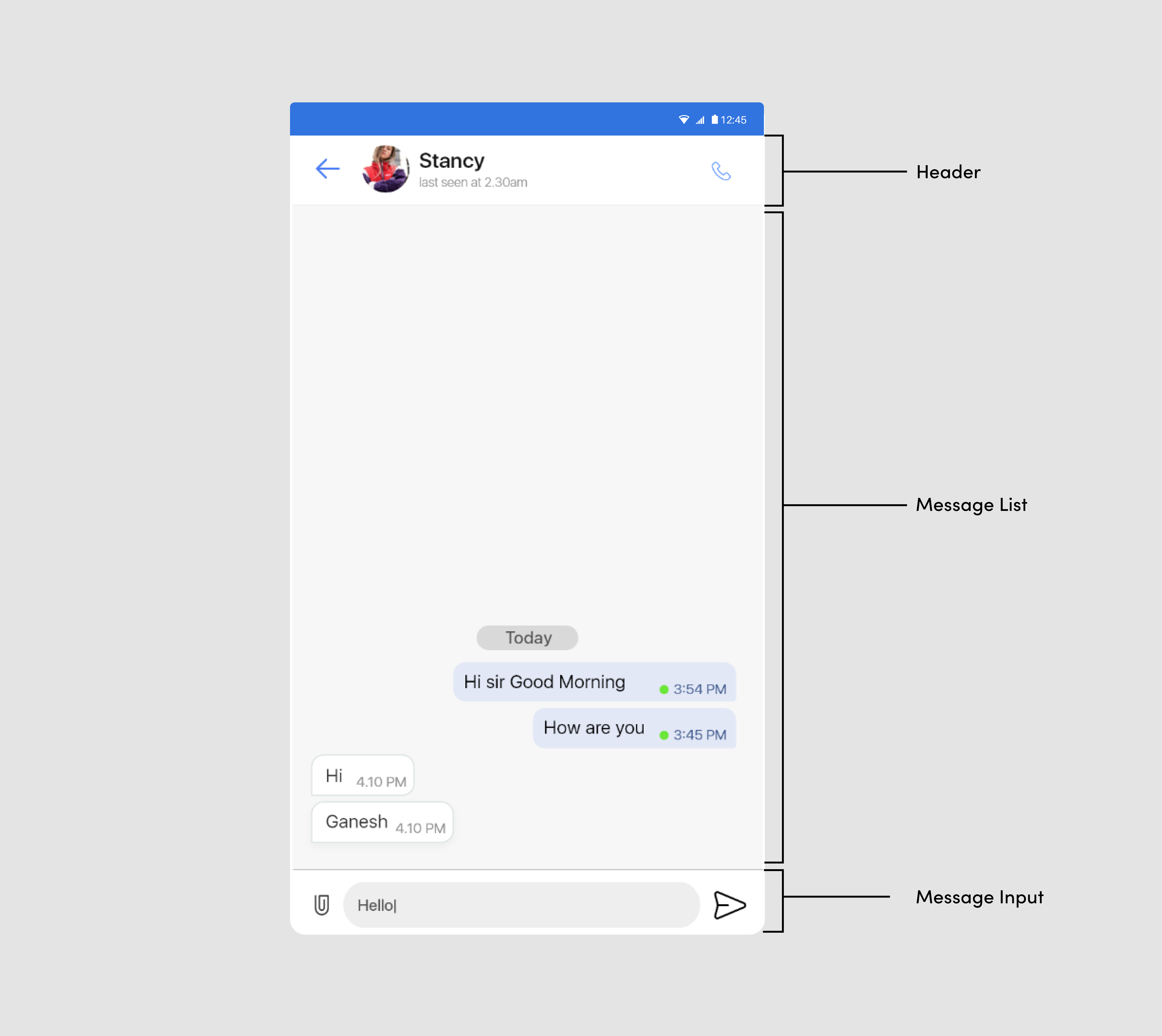
FlyChatWidget.MirrorFly.RecyclerView.Message, Widget.MirrorFly.Message.User, Widget.MirrorFly.Message.Timeline, Widget.MirrorFly.MessageInput
ContactWidget.MirrorFly.UserPreview, Widget.MirrorFly.RecyclerView
CommonComponentsWidget.MirrorFly.AppBar, Widget.MirrorFly.RecyclerView, Widget.MirrorFly.DialogView, Widget.MirrorFly.StatusFrame

ColorSet#

The ColorSet is the set of colors provided by UIKit for Android and is fully customizable.

<?xml version="1.0" encoding="utf-8"?>
<resources>
<color name="primary_500">#491389</color>
<color name="primary_400">#6211c8</color>
<color name="primary_300">#742ddd</color>
<color name="primary_200">#c2a9fa</color>
<color name="primary_100">#dbd1ff</color>
<color name="secondary_500">#066858</color>
<color name="secondary_400">#027d69</color>
<color name="secondary_300">#259c72</color>
<color name="secondary_200">#69c085</color>
<color name="secondary_100">#a8e2ab</color>
<color name="error_500">#9d091e</color>
<color name="error_400">#bf0711</color>
<color name="error_300">#de360b</color>
<color name="error_200">#f66161</color>
<color name="error_100">#fdaaaa</color>
<color name="background_700">#000000</color>
<color name="background_600">#161616</color>
<color name="background_500">#2c2c2c</color>
<color name="background_400">#393939</color>
<color name="background_300">#bdbdbd</color>
<color name="background_200">#e0e0e0</color>
<color name="background_100">#eeeeee</color>
<color name="background_50">#ffffff</color>
<color name="onlight_01">#e1000000</color>
<color name="onlight_02">#80000000</color>
<color name="onlight_03">#61000000</color>
<color name="onlight_04">#1e000000</color>
<color name="ondark_01">#e1ffffff</color>
<color name="ondark_02">#80ffffff</color>
<color name="ondark_03">#61ffffff</color>
<color name="ondark_04">#1effffff</color>
<color name="information">#adc9ff</color>
</resources>