Other Components
Customizing strings, icons, and style resources is straightforward: Simply overwrite the resources files by changing the UIKit-defined style values in them. The xml elements and tables below show the supported sets of components you can customize.
Note : Do not change the names of the UIKit-defined items and parents when customizing.
StringSet#
Header (Toolbar / Appbar)#
The header acts as an optional ActionBar used in every style.
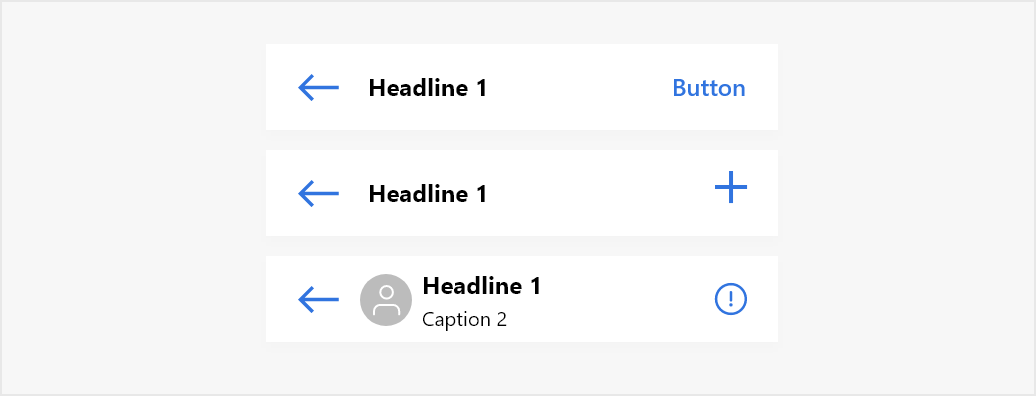
List of attributes of Widget.MirrorFly.AppBar#
| Attribute | Resource type | Description |
|---|---|---|
| android:background | drawable/color | The background of the header. |
| mf_appbar_title_appearance | text appearance | The text size, color, font, and style of the header title. |
| mf_appbar_description_appearance | text appearance | The text size, color, font, and style of the header description. The header description is used to show the typing indicator and the time of when a user has last seen. |
| mf_appbar_button_tint | color | The color of the buttons. |
| mf_appbar_divider_color | color | The color of the line divider located at the bottom. |
| mf_appbar_left_button_text_appearance | text appearance | The text size, color, font, and style of the left button. |
| mf_appbar_left_button_text_color | color | The text color of the left button. |
| mf_appbar_left_button_tint | color | The color of the left button. |
| mf_appbar_left_button_background | drawable/color | The background of the left button. |
| mf_appbar_right_button_text_appearance | text appearance | The text size, color, font, and style of the right button. |
| mf_appbar_right_button_text_color | color | The text color of the right button. |
| mf_appbar_right_button_tint | color | The color of the right button. |
| mf_appbar_right_button_background | drawable/color | The background of the right button. |
RecyclerView#
RecyclerView is used to show the chat list, user list, and message list.
List of attributes of Widget.MirrorFly.RecyclerView#
| Attribute | Resource type | Description |
|---|---|---|
| android:background | drawable/color | The background of the RecyclerView. |
| mf_pager_recycler_view_use_divide_line | boolean | Determines whether to use line dividers between messages. |
| mf_pager_recycler_view_divide_line_color | color | The color of the line divider. |
| mf_pager_recycler_view_divide_line_height | size | The height of the line divider. |
| mf_pager_recycler_view_divide_margin_left | size | The width of the empty space to the left of the line divider. |
| mf_pager_recycler_view_divide_margin_right | size | The width of the empty space to the right of the line divider. |
Dialog#
UIKit provides dialog through the MirrorFlyDialogFragment. This dialog includes a list type, an edit text type, a content view type, up to three buttons, and more. The following table lists the dialog styles that appear in UIKit.
Dialog styles#
| Resource type | Attribute |
|---|---|
| List | 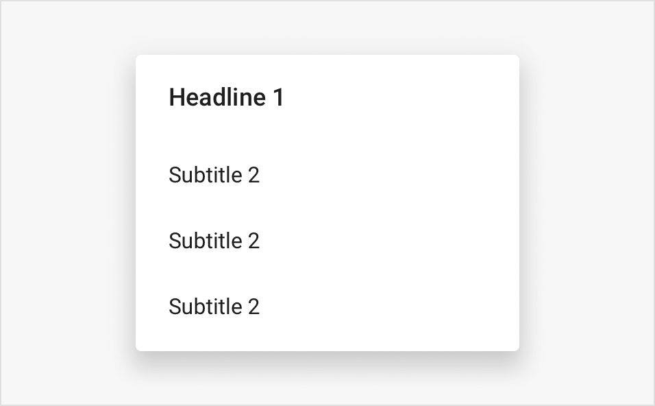 |
| Confirm | 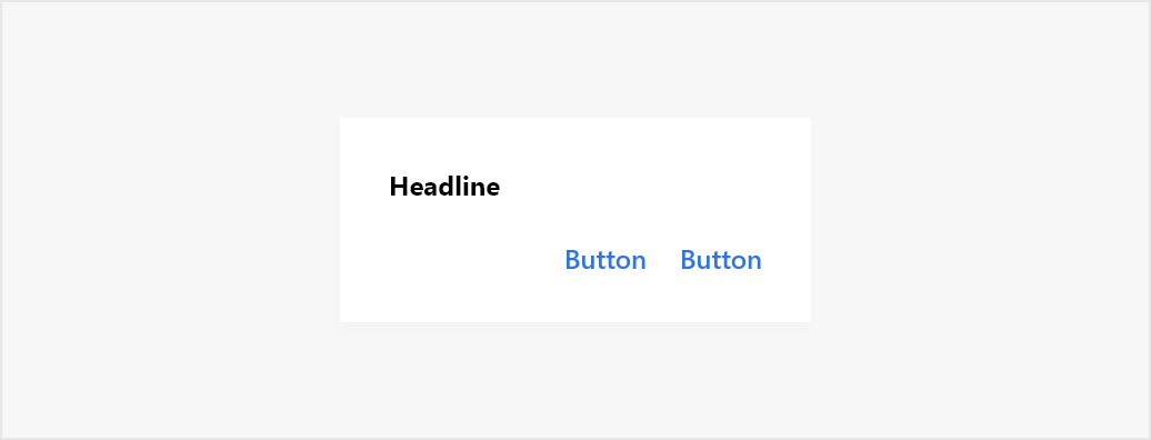 |
List of attributes of Widget.MirrorFly.DialogView#
| Attribute | Resource type | Description |
|---|---|---|
| mf_dialog_view_background | drawable/color | The background of the dialog. |
| mf_dialog_view_background_bottom | drawable | The background of the bottom dialog. |
| mf_dialog_view_title_appearance | text appearance | The text size, color, font, and style of the title.. |
| mf_dialog_view_message_appearance | text appearance | The text size, color, font, and style of the message. |
StatusFrame#
StatusFrame displays the current state when data is loading and data loading failed.
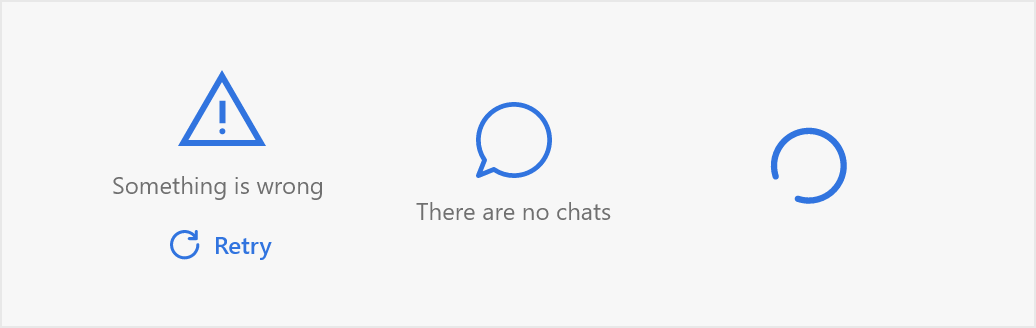
List of attributes of Widget.MirrorFly.StatusFrame#
| Attribute | Resource type | Description |
|---|---|---|
| mf_status_frame_background | drawable/color | The background of the status frame. |
| mf_status_frame_text_appearance | text appearance | The text size, color, font, and style of the text on the status frame. |
| mf_status_frame_icon_tint | color | The color of the icons. |
| mf_status_frame_action_text_appearance | text appearance | The text size, color, font, and style of the action. |
| mf_status_frame_action_background | drawable/color | The background of the action. |
SelectChatTypeView#
This style will be used when you select a chat.
List of attributes of Widget.MirrorFly.SelectChatTypeView#
| Attribute | Resource type | Description |
|---|---|---|
| android:background | drawable/color | The background of component. |
| mf_select_chat_type_menu_background | drawable | The background of each menu item. |
| mf_select_chat_type_menu_title_appearance | The text size, color, font, and style of the menu title. | |
| mf_select_chat_type_menu_name_appearance | text appearance | The text size, color, font, and style of the menu name. |
| mf_select_chat_type_menu_icon_tint | color | The color of the icons. |
style_custom.xml#
To customize the user defined style for each widget like Appbar, Recyclerview, MessageInput, Timeline and etc, create a style_custom.xml in the res/values and add the style attributes as follows.